
Price Tag Design: The Complete Guide to Labels That Actually Work
01The One Question Every Price Tag Design Must Answer
Here is the only design test that matters: can a customer pushing a shopping cart find the price in under two seconds?
If the answer is no, the design has failed. It does not matter how elegant the typography looks on a designer’s monitor or how many features the tag supports. A price tag has exactly one job, and every element that competes with that job is what we call design debt.
Most price tag design failures do not come from bad aesthetics. They come from wrong priorities. The tag tries to do too many things at once, and the price — the one thing the customer actually came for — gets buried.
The Information Hierarchy Pyramid — Price First, Everything Else Second
Think of a price tag as a split-second communication tool, not a product brochure. The information on it must follow a strict hierarchy. Each layer earns its place by answering one question: does this help the customer make a buying decision faster?
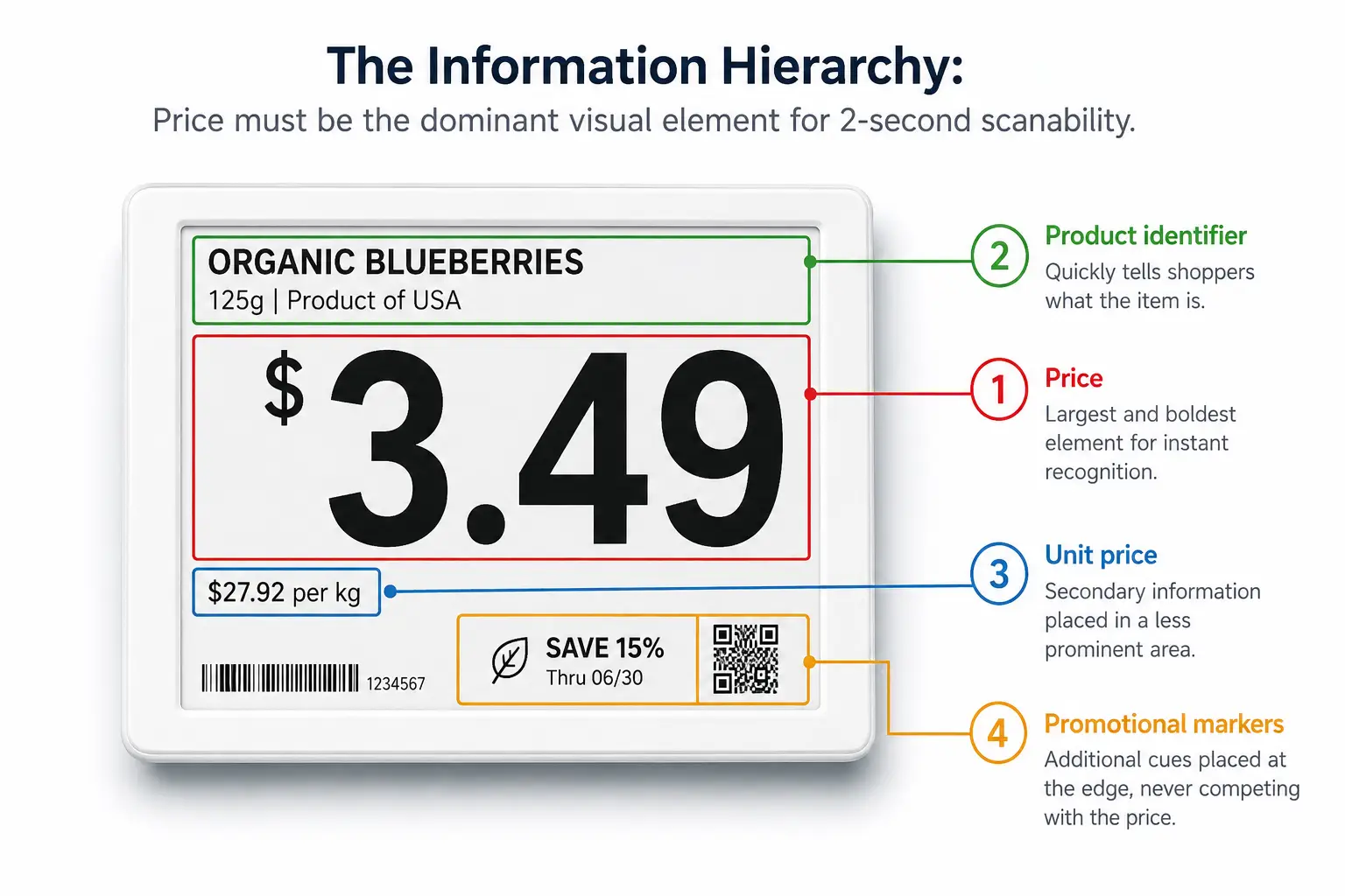
- Layer 1: Price. This is the dominant element. It should occupy the largest font size, the highest contrast position, and the most predictable location on the tag. When a shopper glances at a shelf edge from arm’s length — about 50 centimeters — the price must register before anything else.
- Layer 2: Product identifier. The product name or SKU name belongs in the second visual tier — smaller than the price but still clearly legible.
- Layer 3: Unit price. This is the comparison tool — price per ounce, per liter, per count. It should be visible but clearly subordinate.
- Layer 4: Promotional markers and supplementary information. Sale badges, loyalty prices, QR codes, and deposit information belong at the bottom of the visual stack.
A useful rule of thumb: every element above the price on the hierarchy pyramid is a tax on your customer’s attention. Collect enough of those taxes, and the customer stops reading the tag altogether. They either guess the price or skip the purchase.
The Aldi Test — Why the Simplest Price Tag Wins Every Time
The best real-world evidence for information hierarchy comes from comparing two grocery retailers at opposite ends of the design spectrum.
Aldi’s electronic shelf labels do one thing: show the price. A dozen eggs reads “$1.66” in large black text on a white background. When an item goes on sale, the background shifts to red with white text — same size, same position, no additional decoration.
At certain Whole Foods locations, the same shelf edge tells a different story. A single electronic label might display three prices simultaneously: regular price, sale price, and Prime member price. Add a sale icon, a unit price in smaller type, and occasionally a supplemental paper tag. The result is a “cluttered look” where prices become “tiny” and difficult to read.
The lesson is not that Whole Foods made bad technology choices. It is that the technology’s capability — the fact that an ESL can display three price tiers plus icons — became a trap. Capability drove design instead of customer needs driving design.
Before adding any element to a price tag, apply the Aldi Test: if this information disappeared, would the customer still be able to make a purchase decision? If yes, it probably should not be there.
02From Paper to Pixel — Why Price Tag Design Rules Are Changing
For most of retail history, price tag design meant one thing: graphic layout on a fixed-size piece of paper. Pick a font. Set the price in large type. Add the product name. Send the file to print. The design decisions were static because the medium was static. A paper tag could not change its content, adapt its color to the promotion calendar, or reconfigure itself for a different store zone. It was one design, printed once, replaced manually.
Digital price tags — electronic shelf labels, or ESLs — dismantle every one of those constraints. Prices can update across hundreds of stores in seconds. A tag in the freezer aisle can use a different template than one in the produce section. Promotional colors can activate and deactivate automatically based on the promotion calendar. The tag is no longer a printed artifact; it is a live display surface connected to a software system.
This shift rewrites the design rulebook. Three new questions emerge that paper-era designers never had to ask.
First, consistency at scale: without governance, 500 stores quickly become 500 different designs. If every store manager has editing access, the chain’s price tags will diverge into 500 different styles within months.
Second, environmental adaptation: A digital tag can and should change. The display that works perfectly under warm ambient lighting may wash out under the blue-white LEDs of a refrigerated case. Design must now account for where the tag lives.
Third, brand expression within technical limits: An E-ink display can show black, white, red, and yellow — four colors, not the full Pantone library. The design challenge shifts to building a visual system that works within the medium’s constraints while still feeling on-brand.
These questions have no paper-era answers. The rest of this guide addresses them systematically.
03Typography, Color, and the Science of Scanability
If information hierarchy is the architecture of a price tag, typography and color are the building materials. Get them wrong, and even a perfectly structured tag becomes unreadable.
Font Choices and Sizing — What Actually Works on a Shelf Edge
Electronic shelf labels use E-ink or LCD display technology, not paper and ink. That distinction reshapes every typography decision.
E-ink displays typically operate at resolutions between 100 and 200 dots per inch — significantly lower than the 300-plus DPI of printed materials. At these resolutions, thin strokes break apart. Serifs blur into noise. A font that looks crisp and professional on a printed tag can turn muddy and illegible on an E-ink screen.
The practical implications are clear. Use sans-serif typefaces. Arial, Helvetica, and Roboto render cleanly on low-resolution displays because their uniform stroke widths survive the resolution drop. A maximum of two font families should appear across all templates in a store. Beyond two, the visual language fractures and the shopper’s eye has to re-learn the reading pattern with every aisle.
Size matters more on E-ink than on paper. A price displayed at 14-point equivalent is the practical minimum for readability at one meter. Product names can drop to 10 points. Unit pricing — the fine print of retail — should stay above 8 points, but must be compensated with higher contrast to remain usable. Anything below 8 points on a 100-DPI E-ink screen is functionally invisible from shopping distance.
Font weight demands attention. Light and thin weights — 300 and below — tend to disappear on E-ink panels, especially under the harsh overhead lighting of a supermarket. The minimum safe weight is Regular (400). For the price itself, Medium (500) or Bold (700) provides the extra presence that turns a glance into a read.
- 4.5:1 minimum contrast (WCAG 2.1 AA)
- Sans-serif only on E-ink (100–200 DPI)
- 14pt minimum for price text at 1m distance
The Web Content Accessibility Guidelines (WCAG) 2.1, while designed for digital screens, offer a useful benchmark: a minimum contrast ratio of 4.5:1 between text and background for normal-sized text. Black text on white — a ratio of 21:1 — exceeds this standard dramatically. That is the baseline. Any design that drops below 4.5:1 is asking the customer to work harder than necessary.
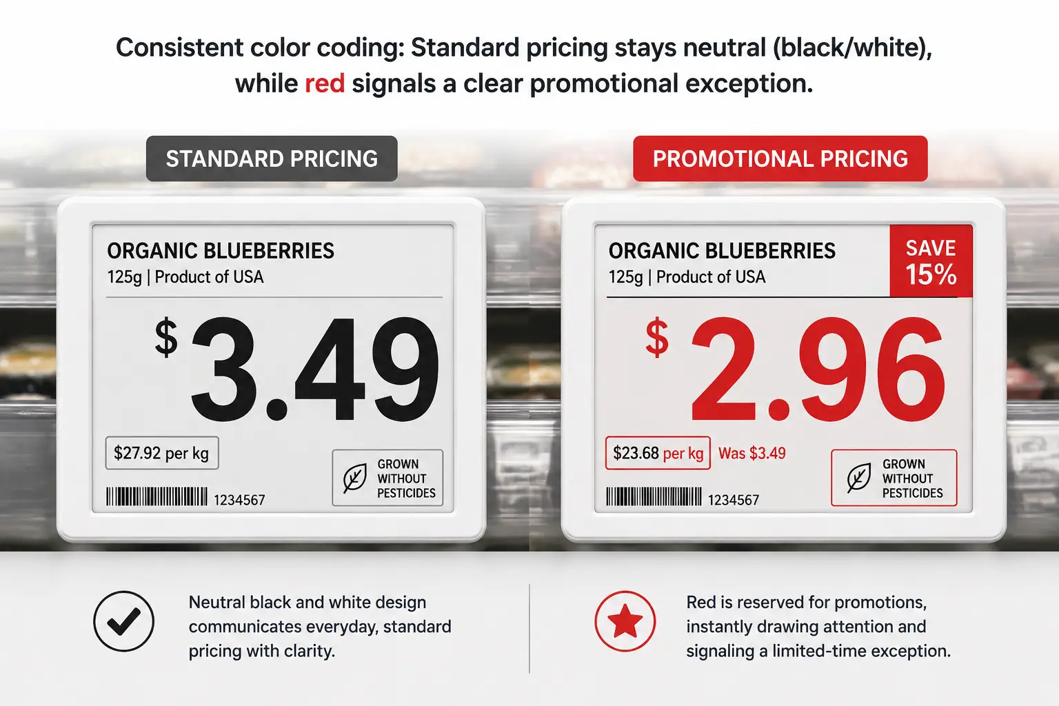
Color Coding That Works — When Red Means Sale, Not Chaos
Color on a price tag is not decoration. It is a signaling system. Used with discipline, it teaches customers a visual language that makes every shopping trip faster. Used without discipline, it becomes noise.
Approximately 8 percent of men and 0.5 percent of women have some form of red-green color vision deficiency — roughly 350 million people worldwide. This alone should disqualify any design that relies solely on red-versus-green color distinction to convey critical pricing information.
A disciplined color system for price tags follows three rules:
Rule 1: Standard pricing stays black on white. This is the highest-contrast combination available — 21:1 — and it works for every customer regardless of vision differences. Standard pricing should never use color because it does not need to. The neutrality of black-on-white is itself a signal: nothing special here, no urgency, the price is what it is.
Rule 2: Color marks exceptions, not everything. Red means “this price is different from normal.” It can color the price digits themselves, or serve as a background for promotional tags — but it should never appear on standard-price tags. When red shows up, the customer should know something changed without reading a single word. Yellow works as a highlight accent — a “limited time” bar or a promotional stripe — but should not replace red’s role as the primary deviation signal.
Rule 3: The color code must be store-wide and non-negotiable. If red means “on sale” in aisle three but “organic product” in aisle seven, the system has failed. Customers learn the visual language through repetition. Consistency across every category, every zone, and every store is what makes the code work. It takes roughly two to three shopping trips for a regular customer to internalize a well-designed color system — and roughly one inconsistent tag to break their trust in it.
Modern four-color E-ink displays — supporting black, white, red, and yellow — give retailers exactly enough palette to execute this system. The constraint is the feature: four colors force discipline. A full RGB LCD screen would invite the same overdesign that plagues so many digital signs. Four colors is enough to signal status clearly, and not enough to paint a rainbow that means nothing.
04Designing Price Tags That Survive the Real World
A price tag that looks flawless on a design mockup but fails in a freezer aisle is not well-designed. It is designed for the wrong environment. Real-world retail is wet, cold, hot, dusty, brightly lit, dimly lit, and occasionally knocked into by shopping carts. The physical design of the tag — its materials, its sealing, its mounting — determines whether the visual design ever gets a chance to work.
Zone-Specific Design — One Tag Does Not Fit All
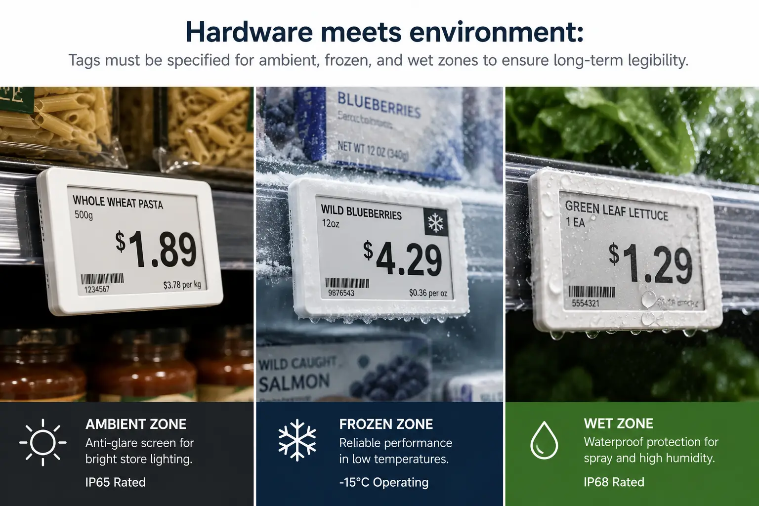
Most retailers make the same mistake when deploying electronic shelf labels: they order one tag model, one specification, and install it everywhere. A supermarket is not one environment. It is at least four distinct zones, each with its own physical demands.
Ambient dry-goods aisles are the easy case. Standard tags work here. The main design concern is not durability but glare — overhead fluorescent or LED lighting can create reflections that wash out an E-ink display at certain angles. Tags with a matte surface finish and a slight downward tilt reduce this problem to nearly zero.
Refrigerated and frozen sections introduce cold. At temperatures below -15°C, E-ink displays slow down: a screen refresh that takes under one second at room temperature can take three to five seconds in a freezer. Battery chemistry also suffers. These zones demand tags rated to at least IP65 for dust-tight sealing and protection against low-pressure water jets from cleaning and defrost cycles. Condensation is the enemy: a tag that is not fully sealed will accumulate moisture inside the housing, eventually corroding the circuit board.
Fresh produce and wet zones are even harsher. Regular misting systems spray water directly onto shelf edges. Tags here need IP68-rated enclosures — fully dust-tight and capable of withstanding continuous immersion — plus anti-fog surface treatments on the display cover. A tag that fogs up is a tag that cannot be read.
Checkout aisles and end-cap displays sit at close range and get touched. Customers pick up products from end caps, and their hands — or the products themselves — scrape against the tags. A surface hardness of 3H or higher on the pencil-hardness scale resists everyday scratches. For high-traffic areas near the register where tags face constant contact, 6H or a replaceable screen protector is worth the incremental cost.
Materials and Durability — What Your Tag Is Made Of Matters
The exterior of an electronic shelf label is usually ABS plastic, polycarbonate (PC), or an ABS-PC alloy. The choice matters more than most buyers realize.
ABS is affordable and adequate for ambient environments. Its heat deflection temperature sits around 85°C — more than sufficient for a dry-goods aisle. But ABS is brittle in cold temperatures and can crack if a frozen-food shelf gets knocked by a stocking cart.
Polycarbonate withstands impacts far better and deflects heat at roughly 135°C, making it suitable for environments with wide temperature swings. The trade-off is cost — PC is typically 30 to 50 percent more expensive than ABS per unit. For most retail deployments, an ABS-PC alloy splits the difference: better cold resistance than pure ABS, more affordable than pure PC.
The display surface itself involves another decision. Some ESL designs place the E-ink panel behind a protective glass or acrylic window. Others expose the panel directly — a frameless design that reduces reflections and looks sleeker, but sacrifices scratch resistance. For tags in the cereal aisle, frameless works. For tags in hardware or building-materials retail, where shelving takes real abuse, a protected panel with a replaceable cover is the safer bet.
Battery life is the hidden durability metric. An E-ink tag running on a standard coin cell can last five to ten years under normal conditions because E-ink consumes power only during screen refreshes. LCD-based tags, which require constant power to maintain an image, typically need battery replacement every one to two years. The total cost of ownership difference — factoring in labor for battery swaps across thousands of tags — is substantial enough to influence the initial design specification.
Mounting hardware is the least glamorous part of price tag design. It is also the most common point of failure. A tag that falls off the shelf is a tag that displays nothing. Rail-mounted clips, magnetic backs, cable ties, and adhesive brackets each suit different shelf types. The design mistake to avoid is assuming one mounting method fits all: a rail clip that works perfectly on standard gondola shelving may be useless on a wire basket in the produce section. A complete deployment plan specifies mounting hardware per zone, not per store.
05Template Governance — One Design, 500 Stores
A single supermarket carries somewhere between 50,000 and 150,000 stock-keeping units. A 500-store chain manages pricing display for tens of millions of tag instances. Without template governance, every one of those tags becomes a tiny design decision delegated to whoever happens to be editing the template that day.
Template governance is not a creative exercise. It is systems engineering applied to visual design. The goal is simple: make every price tag in every store look like it came from the same company — while still accommodating the real variation between product categories, promotion types, and regional requirements.
The governance framework rests on five pillars:
| Governance Dimension | The Problem It Solves | The Approach |
|---|---|---|
| Required-field rules | Missing data leaves blank spaces on live tags | Price, product name, and unit price are base-level required fields. Promotional dates and QR codes are conditional — they appear only when their data source provides a value. |
| Category template variants | Food, non-food, and fresh items need different information layouts | Each category gets exactly two templates: a standard version and a promotional version. More than two per category creates maintenance chaos. |
| Promotional design escalation | Sale tags need more visual urgency but must not break the store’s visual system | Keep the layout structure identical. Change only the color treatment: red price digits replace black ones, or the background shifts to a promotional color. The skeleton stays the same. |
| Missing-data fallbacks | Database fields occasionally return null — the tag cannot show a blank | Every field has a pre-configured fallback value. A missing promotional end date might display “While supplies last.” A missing unit price might show “See store associate.” |
| Brand expression boundaries | The chain needs visual consistency, but individual banners or regions want personality | Reserve a small, fixed zone — the bottom 10 to 15 percent of the tag area — for brand elements. Logo, a brand-color accent bar, or a tagline lives here. The information zone above it remains standardized across the entire chain. |
A practical ceiling exists for template count. Beyond 10 to 15 active templates across a retail chain, the maintenance burden — updating, testing, and auditing each template across every store — grows faster than the benefit of the additional variation. Template discipline means saying no to requests for “just one more special template” far more often than saying yes.
06Bringing It All Together — Design Excellence, Delivered at Scale
Price tag design, at its best, is invisible. The customer finds the price without thinking about it. The store manager never fields a complaint about a tag that does not update. The procurement team never discovers, six months after deployment, that the tags in the freezer aisle have been slowly corroding because the specification did not mention IP ratings.
The principles in this guide — information hierarchy first, typography and color built for scanability not decoration, environmental design matched to real store zones, and template governance that treats design as a system rather than a collection of one-off decisions — together form a design standard that works at the scale of modern retail.
If you are evaluating a price tag solution for your stores, here are the questions that matter. Can the manufacturer deliver custom-designed samples in under a week, so you can test real tags on real shelves before committing to thousands of units? Does their product line span the full size range — from compact 2.13-inch tags for cosmetics aisles to 7.5-inch displays for warehouse racking — so you are not forced to compromise one zone for another? Do they support multi-color displays for promotional design flexibility without pushing you into expensive full-color LCD screens? And can their software platform give your team direct control over template design, rather than locking every visual decision behind a vendor’s service ticket queue?
Design is the soul of a price tag. Manufacturing capability is the body that carries it into the real world. Both are necessary. Neither is sufficient alone. When you find a partner who treats industrial design, visual design, and system design as a single integrated discipline — from the circuit board to the shelf edge — you have found a partner who can deliver what the Aldi Test demands: a price tag that does its job so well, no one ever notices it was designed at all.
For retailers seeking a partner who combines design flexibility with manufacturing depth, Zhsunyco offers a full-spectrum custom ESL design service — from seven-day sample turnaround and four-color E-ink displays to OEM customization across sizes, shapes, logos, and communication protocols — built on a 20,000-square-meter production floor with 12 dedicated assembly lines. Explore their custom ESL design service to see how design intent translates into shelf-ready hardware.
References
- W3C. “Web Content Accessibility Guidelines (WCAG) 2.1.” 2018. https://www.w3.org/TR/WCAG21/
- National Eye Institute (NEI/NIH). “Facts About Color Blindness.” https://nei.nih.gov/health/color_blindness/facts_about
- Grocery Dive. “More than a Store: Electronic Shelf Labels Pose Pricing Conundrum.” https://www.grocerydive.com/news/more-than-a-store-electronic-shelf-labels-grocers-pricing-value/817515/
