


Looking for window display ideas you can adapt to your own shop? Start with one clear reason for someone to stop: an unexpected product, a useful offer, a seasonal scene, or a glimpse of an experience waiting inside.
A retail window display, also called a shop window display, is a curated arrangement of products, props, graphics, and lighting visible from outside the store. Its job is to make the merchandise and the message easy to understand, then give the passerby a reason to enter or explore further. A beautiful installation still needs to connect with something customers can buy.
Below are 15 practical concepts, six documented examples, and a build process for independent retailers and growing chains. Use the seasonal matrix, budget alternatives, and six-month calendar to turn inspiration into a repeatable plan.
Why Your Window Display Is a 24/7 Silent Salesperson
A passerby may give your storefront only a brief glance. In that moment, your window does the talking: it introduces what you sell, suggests the experience inside, and gives someone a reason to stop rather than keep walking.
Think of your storefront window as a movie trailer. A good trailer does not show the entire film; it reveals enough to create curiosity about what comes next. Your window should do the same. A focused product selection, a recognizable setting, and a clear message can make the decision to enter feel easier.
When the store is closed, a visible, appropriately lit window can continue introducing the business. A relevant QR code, clear opening hours, or a memorable product scene can give an interested passerby a route to your website or a reason to return. The aim is not simply to decorate the glass, but to connect attention outside with a useful next step.
15 Retail Window Display Ideas You Can Adapt to Your Store
Choose retail window display ideas that match your goal, available space, and update capacity. A small shop may need a strong product focus and a reusable prop kit; a larger store may have room for a scene or a screen. The concepts below include both.
| Your priority | Try these ideas | Start by measuring |
|---|---|---|
| Make a product easy to understand | Hero product, lifestyle scene, curated bundle | Featured-product enquiries and sales |
| Stand out on a busy street | Oversized prop, color block, repeated shapes | Stops and store entry rate |
| Keep a familiar storefront fresh | Seasonal scene, local collaboration, paper installation | Repeat visits and campaign response |
| Explain or demonstrate something | Live demonstration, QR story, digital screen | Demo attendance, scans, product enquiries |
1. Give One Hero Product a Gallery-Style Setting
Best for: jewelry, accessories, beauty products, and premium homeware.
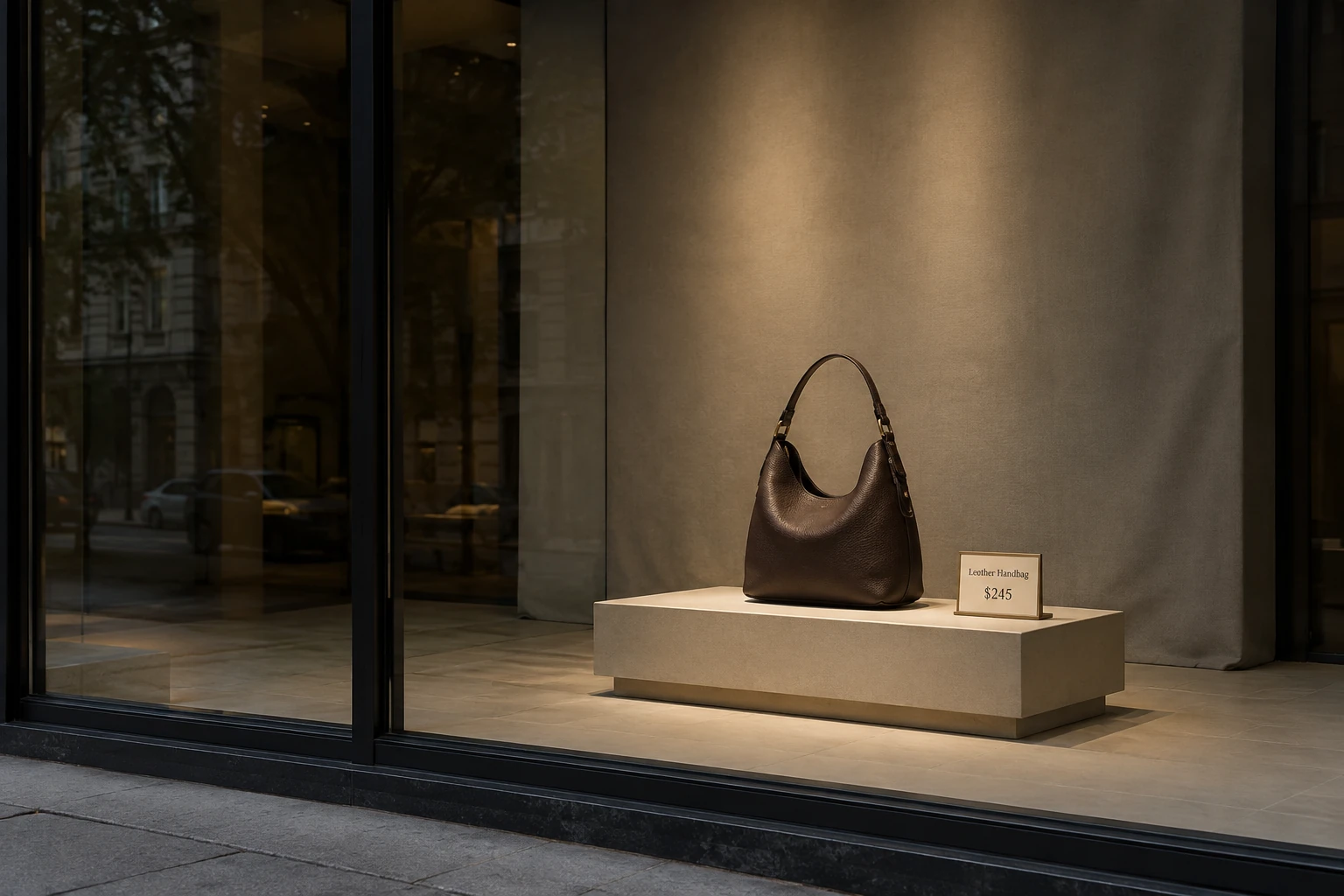
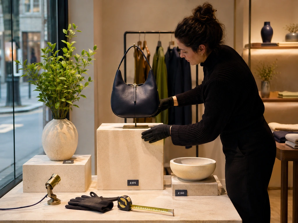
Place one product on a raised plinth against a calm backdrop, then direct a spotlight toward it. A small label can name the product or explain its distinctive feature. The space around the object makes its shape easier to read from the pavement.
Try it: display a handbag on a painted box with one contrasting fabric panel behind it. Use the same color on an interior display so the shopper can find the bag after entering. Avoid surrounding the hero with every available colorway; those can be shown inside.
2. Build a Lifestyle Scene Around the Product
Best for: furniture, fashion, outdoor equipment, and kitchenware.
Show the purchase in use: a reading corner with a lamp and blanket, a picnic scene with a cooler and reusable cups, or a breakfast setting built around handmade mugs. A specific moment gives unrelated products a shared purpose.
Try it: choose “Sunday breakfast for two” rather than a broad “home collection” theme. Keep enough space between the hero product and background props to distinguish what is for sale. Put the featured collection together inside the store and identify any display-only props.
3. Use an Oversized Prop to Make Your Category Obvious
Best for: skincare, confectionery, footwear, and shops whose product category is unclear from the street.
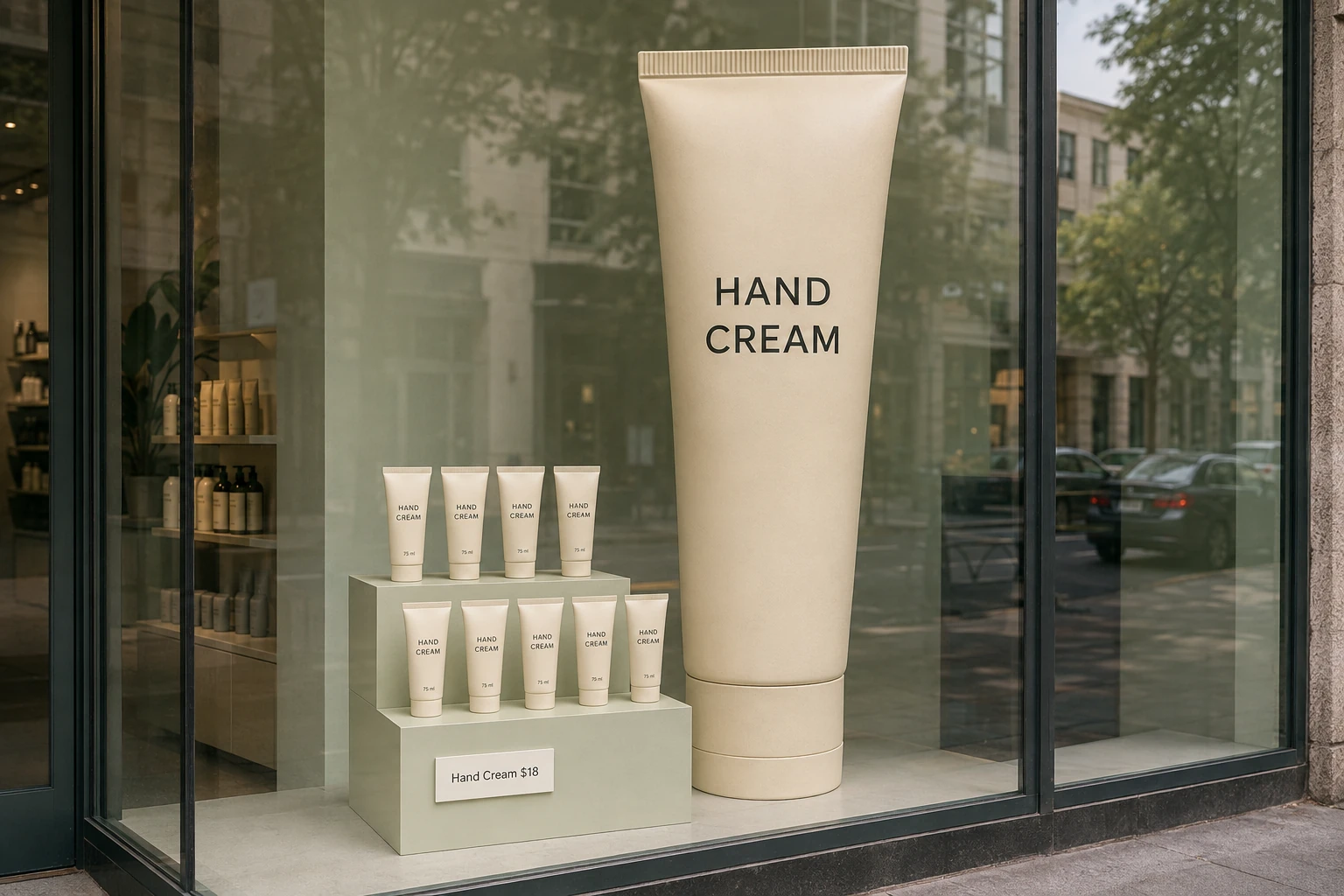
An enlarged product silhouette can attract attention while explaining the business. A giant tube behind real skincare products or an oversized book framing a reading selection gives the window a clear subject.
Try it: prototype the outline in cardboard before commissioning a dimensional version. Check that pedestrians can still see the actual merchandise. The prop should lead to the product; if visitors remember the sculpture but cannot tell what you sell, revise the composition.
4. Commit to One Color Family
Best for: apparel, cosmetics, gift shops, and product launches.
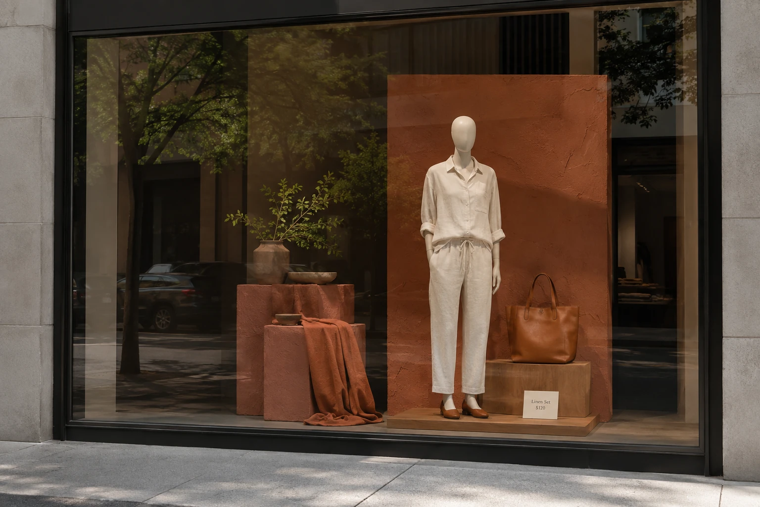
Repeat one dominant color across the backdrop, packaging, and supporting props, then use a contrasting accent for the hero. This creates a coherent scene even when the objects vary in size and material.
Try it: build a terracotta window with a cream outfit and warm wood risers. A florist could use green foliage around one vivid bouquet. Check actual product colors under the installed lighting: a dramatic background should not make the merchandise look like a different shade.
5. Repeat a Shape, Then Break the Pattern
Best for: shoes, eyewear, packaged goods, and narrow windows.
A row of repeated frames, circles, boxes, or product silhouettes creates rhythm. One change in height, color, or orientation signals where to look first. This is useful when a single small item would disappear in a large window.
Try it: mount several identical frames on a plain background, with the hero product occupying the only illuminated frame. Keep the spacing deliberate. Repetition needs a visual stopping point; an uninterrupted product grid can resemble shelving rather than a curated display.
6. Curate a Ready-to-Buy Bundle
Best for: fashion, travel goods, gift shops, and specialty food retailers.
Help customers solve a recognizable task: a weekend away, a first coffee setup, a host’s gift, or a rainy commute. Group a small number of complementary items and make the offer easy to understand.
Try it: show a tote, compact umbrella, and raincoat under a “Ready for the forecast” message. If a bundle price is advertised, specify which items it covers. Check stock before installation and provide a substitute plan when a featured item sells out.
7. Turn One Promotion into a Clear Window Message
Best for: stores with frequent offers, new arrivals, or appointment-based services.
A promotion window can be visually simple: one offer, one product group, and one action. Use a poster, removable decal, or digital screen. Short, legible wording is more useful to moving pedestrians than a paragraph of selling points.
Try it: pair a seasonal product with “Discover the new collection inside.” For a price offer, make the qualifying conditions readable and keep the dates current. Avoid adding several unrelated offers until the main message is no longer obvious.
8. Tell a Story Across Three Small Scenes
Best for: wide windows, bookshops, homeware, and collections with a clear theme.
Arrange the window as a sequence: preparation, experience, and result. An outdoor retailer could show packing a bag, a campsite, and a relaxed morning; a kitchen shop could show ingredients, preparation, and the finished table.
Try it: use repeated colors or props to connect the scenes. Give each one a product focus so pedestrians approaching from either direction still understand part of the story. Do not require a long caption to explain the sequence.
9. Create a Seasonal Scene with Reusable Foundations
Best for: retailers with regular seasonal collections and repeat local foot traffic.
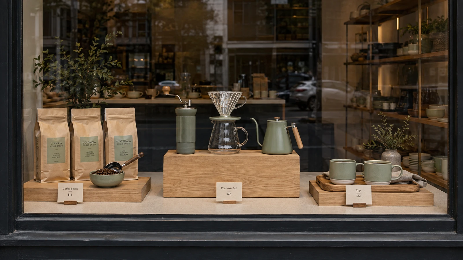
Choose a specific seasonal moment, such as a flower market, coastal picnic, autumn reading nook, or winter gift-wrapping table. Keep the underlying risers and lighting, then change the merchandise, colors, and a few props.
Try it: use neutral crates throughout the year, with terracotta pots in spring and pine-toned accessories in winter. Match the calendar to your local climate and customers. A global campaign may need different seasonal styling in different regions.
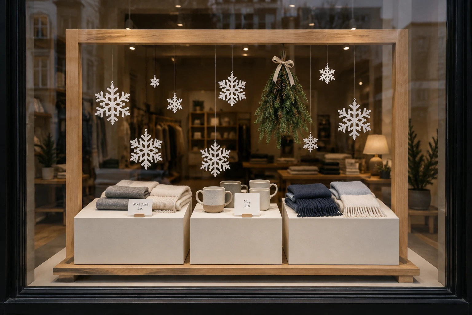
10. Feature a Local Artist or Community Story
Best for: independent boutiques, galleries, bookshops, and neighborhood businesses.
Invite a local illustrator, maker, or community group to contribute a backdrop or installation connected to the store’s products. Include a clear artist credit and a concise explanation of the collaboration.
Try it: pair a local ceramicist’s drawings with their mugs, or build a running-themed window for a neighborhood race. Agree on permissions, installation responsibilities, and the display period before production. The local connection should be specific enough for regular customers to recognize.
11. Make Paper and Reused Materials the Creative Feature
Best for: bookstores, stationery, gifts, and retailers with limited prop budgets.
Paper flowers, folded fans, woven packaging, and cut-out cityscapes can create scale without heavy materials. A limited palette and consistent cutting or folding technique give inexpensive materials a deliberate finish.
Try it: suspend a lightweight paper canopy above a focused product group using appropriate fixings. Test sunlight exposure and keep materials clear of heat sources. If you describe the installation as reused or recycled, explain which materials qualify rather than making a broad environmental claim.
12. Let Customers See the Making Process
Best for: florists, craft retailers, fashion alterations, and stores selling products with visible workmanship.
A scheduled demonstration makes the storefront an event. A florist building a bouquet or a maker finishing a small object gives people something to watch and a reason to ask questions.
Try it: promote a short demonstration at a specific time and display the finished product beside the work area. Plan the staff space, access, and audience flow. If a live performance is impractical, a captioned process video can convey the same story without a permanent demonstration station.
13. Add a QR Code with a Useful Destination
Best for: considered purchases, appointment services, galleries, and after-hours browsing.
Offer a clear benefit for scanning: see available sizes, view the maker’s process, book a consultation, or shop the exact window collection. The destination should match the promise written beside the code.
Try it: place “Shop this window” beside a campaign-specific code and a readable short URL. Test it through the glass, at the expected distance, and in changing light. Track campaign visits separately from general website traffic; a scan alone does not prove a sale.
14. Pair a Digital Screen with Physical Merchandise
Best for: frequent promotions, products that benefit from demonstrations, and multi-store campaigns.
A window screen can show the product in use while the actual object sits beside it. Keep the physical hero visible and make each screen message understandable without sound. Slow, purposeful movement usually makes the composition easier to follow than several competing animations.
Try it: pair a travel bag with a short packing demonstration and one product message. Use a commercial display specified for the window’s light and heat conditions. The next section on digital displays explains what to check before selecting hardware.
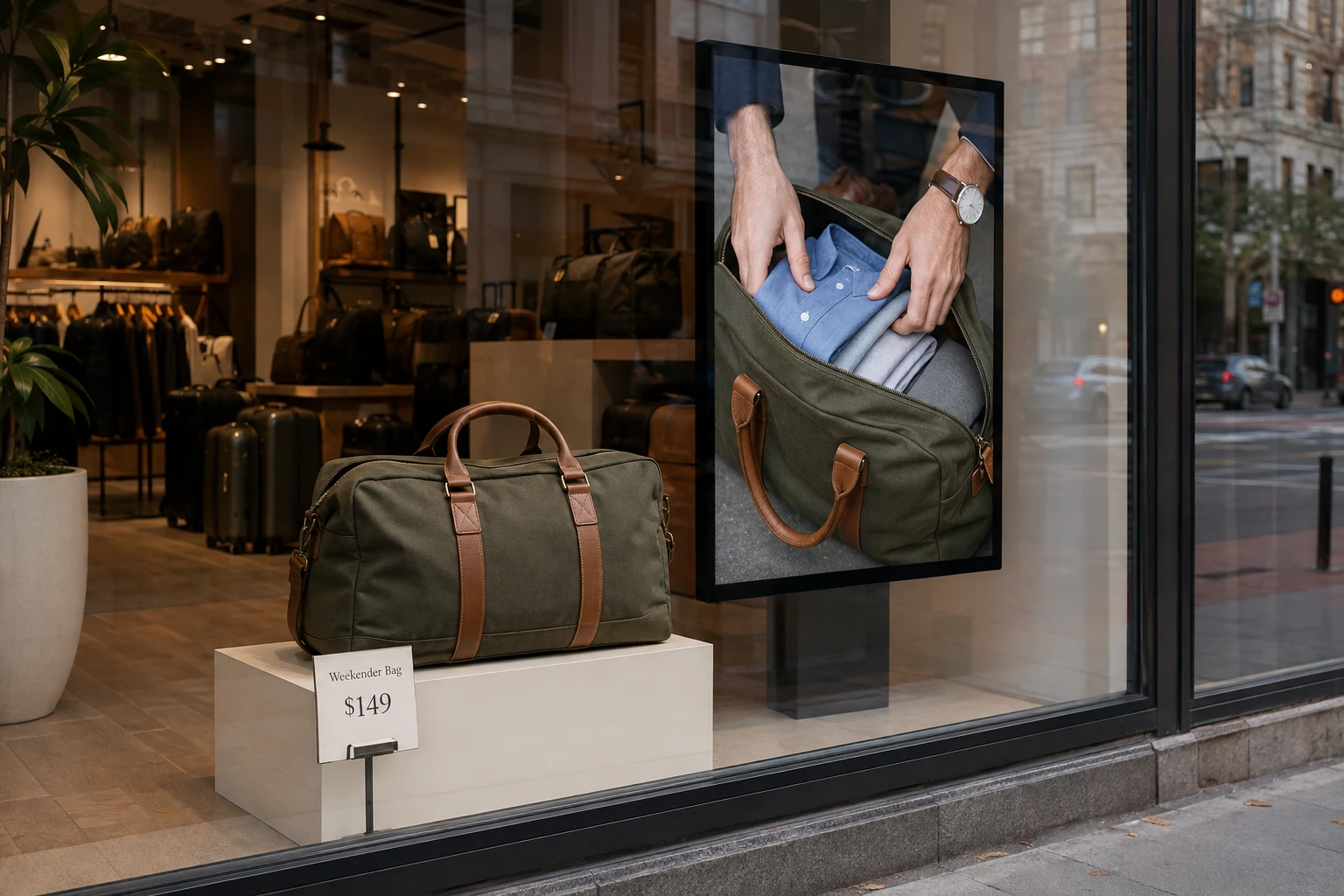
15. Build an Interaction Around One Customer Decision
Best for: customizable products, beauty, footwear, and experience-led campaigns.
A motion-triggered scene, phone-based color selector, or augmented-reality preview gives the visitor an active role. Start with a useful decision—choosing a finish or exploring a product detail—rather than adding interaction for its own sake.
Try it: pilot a simple mobile experience reached from the window before investing in custom interactive hardware. Provide a useful static message when nobody interacts. Through-glass touch, sensors, and AR all need testing in the actual installation and should have a clear maintenance owner.
6 Window Display Examples and What You Can Learn from Them
These six window display examples show how reusable structures, distinctive materials, and focused storytelling can shape a storefront. The adaptation notes are our editorial suggestions for smaller stores; the source pages provide original project descriptions and photographs, rather than evidence of guaranteed sales results.
Gucci: A Mirrored Library that Can Evolve
Gucci’s Endless Narratives window concept brings together shelves, mirrors, books, sculptures, and artworks, with objects changing alongside featured products and collections. The result is a repeatable setting rather than a completely new structure for every launch. View Gucci’s project and photographs.
Adapt the idea: give a boutique a permanent set of shallow display boxes, then rotate objects and products around a monthly theme. Use mirrored surfaces selectively and check reflections from outside. The useful lesson is the reusable framework, not the luxury production budget.
Hermès in Bordeaux: Reused Paper with a Brand Connection
For the reopening of its Bordeaux store, Hermès described window displays by Simone Post using old copies of Le Monde d’Hermès and used orange bags. The materials connected the installation to objects already associated with the house. Read the Hermès project announcement.
Adapt the idea: build a backdrop from your own printed packaging, offcuts, or obsolete catalogs. Repeat one fold or woven pattern to give the materials coherence. Keep the current product selection prominent and describe the reuse accurately.
Hermès in Omotesando: Physical Movement Meets a Digital Scene
The Dreams in Motion windows, presented in 2026 and designed by the duo Deborah Bowmann, combined slowly changing physical scenes with a digital landscape in the window looking into the store. See the official installation description and photographs.
Adapt the idea: give a physical product one supporting animated background. A slow landscape behind outdoor equipment, for example, can establish a setting while keeping the merchandise readable. Coordinate the screen and physical props as one composition instead of treating them as separate advertisements.
Selfridges: One Recognizable Motif Across the Storefront
Selfridges recounts its 2012 celebration of Yayoi Kusama’s Louis Vuitton collaboration, when her art occupied its windows and a large polka-dotted figure appeared above the Oxford Street entrance. See Selfridges’ account of the collaboration.
Adapt the idea: choose an original shape or pattern and repeat it across your own windows, entrance sign, and interior display. Consistency can connect several small installations into one campaign. Develop your own visual language rather than reproducing an artist’s distinctive work without permission.
UrbanGlass: The Window as a Small Exhibition
UrbanGlass hosted Kacie Lees’s Primordial Nucleosynthesis in its Window Gallery in 2025. The exhibition used steel and neon sculptures to explore the early universe. It demonstrates how a window can give a focused body of work a public-facing setting. View the exhibition details and images.
Adapt the idea: curate a small maker exhibition with a name, a short explanation, and a clear route to related products inside. This approach suits craft retailers, galleries, and shops where the process or meaning behind the merchandise matters.
West 10th Window: A Small Space with Apparent Depth
An UrbanGlass report documents Inna Babaeva’s Men O’war installation in a three-foot storefront cube. Mirrored plexiglass expanded the apparent space around the glass objects. This was an art installation rather than a conventional merchandise window. Read the project report and view photographs.
Adapt the idea: use a reflective rear or side panel in a jewelry or accessories shadowbox. Test whether reflections reinforce the hero or duplicate clutter, and keep the product label readable. A small display can feel deliberate without imitating a large department-store scene.
The Four Types of Retail Window Displays — Which One Fits Your Store?
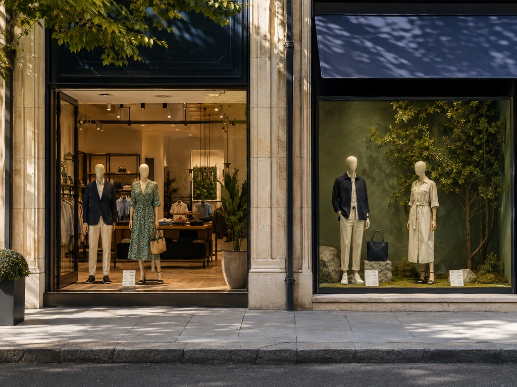
Match your chosen idea to the space you actually have. These four common window formats call for different approaches to depth, sightlines, and the relationship with the store interior.
| Type | Characteristics | Best For | Watch Out For |
|---|---|---|---|
| Open-Back | No wall between window and store interior; passersby see straight into the shop | Boutiques, lifestyle stores, stores with strong interior design | Visual clutter from inside competes with your display. Use a mid-window hanging panel or branded graphic to anchor focus. |
| Closed-Back | Solid wall or backdrop behind the display; complete control over what the viewer sees | Jewelry, accessories, luxury goods, stores on busy streets | Limited depth can feel flat. Build layers forward from the back wall to create dimension. |
| Shadowbox | Small, box-like display enclosures, often elevated | Jewelry, watches, cosmetics, small luxury items | Limited real estate means every millimeter counts. Start with one hero piece and add supporting objects only when they clarify the story. |
| Corner Window | Wraps around a building corner; visible from two approach directions | Stores on corner lots, high-foot-traffic intersections | You’re designing for two sightlines. The display must read clearly from both angles, which usually means two complementary compositions rather than one stretched scene. |
Identify the closest match, then check your actual dimensions and approach angles. Open-back windows need coordination with the interior, while enclosed displays give you more control over the background.
5 Visual Merchandising Principles to Apply to Any Window
Use these as composition tools and test them from the street. Fixed ratios cannot account for every product, window shape, or viewing distance.
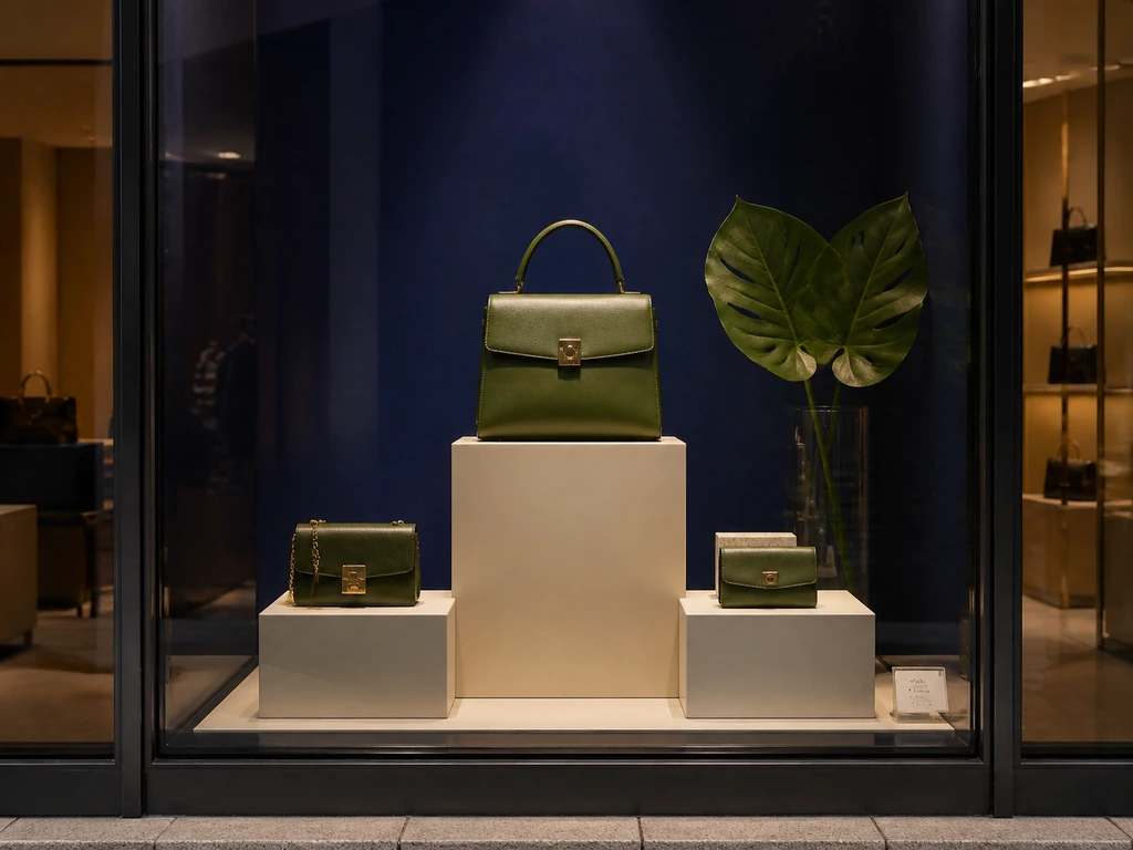
1. Establish One Clear Focal Point
Decide what the passerby should notice first. Make that element distinct through scale, color, light, or the empty space around it. Supporting products should explain or complete the hero. If two equally dominant elements compete, either reduce one or separate them into clearly different scenes.
A useful quick test is to look at the window briefly, turn away, and describe its message. Treat this as a practical editing exercise rather than a scientifically fixed “three-second rule.” If colleagues remember different products and none can identify the offer, simplify the composition.
2. Use Pyramid Grouping to Organize Heights
Place a taller focal element above or behind lower supporting objects to form an approximate triangle. Crates, platforms, mannequins, and hanging props can establish the structure. A broad base often helps anchor the scene, while the highest point creates emphasis.
The hero does not have to sit at the physical peak. Small jewelry may need an eye-level shadowbox while a larger background object forms the triangle. Adjust the composition to the merchandise rather than assigning fixed percentages to each tier.
3. Create Rhythm with Grouping and Repetition
Groups of three offer a useful starting arrangement: one dominant item and two supporting items at different heights. Repeated shapes can also guide attention across a wider window. Neither technique requires a strict item count; one exceptional object or a disciplined repeated pattern can work equally well.
Look for a clear difference between grouped objects and unused space. If every surface is covered, the grouping becomes difficult to read. Edit the supporting props until the product relationships are obvious.
4. Balance Color, Scale, and Visual Weight
Symmetrical arrangements feel orderly; asymmetrical arrangements can feel more dynamic. Balance depends on more than object count. A small bright object may carry as much attention as a larger neutral one, and a lit screen can dominate an otherwise balanced physical display.
Choose a dominant color, a supporting color, and an accent as a starting palette. Check them against the actual product and store identity. You can experiment with a 60/30/10 color split, but treat it as a styling exercise rather than a required formula.
5. Build Depth and Leave Breathing Room
Separate background, middle, and foreground elements so the eye can travel into the scene. Keep the hero away from the glass if reflections obscure it, and leave visible gaps around important shapes. The amount of open space should respond to product scale and the style of the store.
Inspect the arrangement from both walking directions, from directly across the street, and from a seated viewing height. In an open-back window, include the shop interior in that inspection: stock, cables, and signs behind the display all affect the composition.
How to Build a Window Display — A Step-by-Step Guide
Knowing the principles is one thing. Standing in front of an empty window with a deadline is another. Think of the process ahead as directing a three-second silent film — every element must serve the story, and the story must be obvious at a glance. Here’s your director’s handbook, step by step.
Step 1 — Pick a Theme That Resonates With Your Customer
A theme is not “spring.” A theme is “Sunday morning at the farmers’ market.” It’s specific enough to guide every prop and product choice that follows.
Good themes come from five sources. Seasons reinterpreted through a narrow lens: not “summer” but “coastal road trip.” Local events that matter to your specific street’s foot traffic: a neighborhood art fair, a city marathon, the first weekend of patio season. Brand stories that only your store can tell: the artisan who hand-throws your bestselling ceramic mugs, the family-run Italian tannery behind your leather collection. Social media moments that are already in your customers’ feeds: the color of the year, the silhouette everyone’s wearing. Product launches centered on a single hero piece that deserves its own spotlight.
Test every theme candidate against three questions: Can someone understand it in three seconds without reading a sign? Does it connect naturally to products you actually sell? Would your specific customer — not a generic shopper, but the person who walks past your store every Tuesday — stop to look?
Step 2 — Choose Your Hero Product and Supporting Cast
Choose merchandise that fits the campaign, is available to buy, and can be presented clearly from the street. A proven seller can provide a useful starting point; a new arrival can also be a strong hero when the window helps customers understand it.
Your hero product should clear three bars: it suits the campaign and is available (commercial relevance), it photographs beautifully (visual impact), and it has natural companions (cross-sell potential). For a boutique clothing store, the hero might be the dress customers keep trying on but hesitating to buy. Style it with complementary pieces so customers can imagine wearing it.
The supporting cast of 2–4 complementary products exists to complete the story, not compete with it. If the hero is a linen summer dress, the supporting cast might be the straw hat, leather sandals, and woven tote that make the outfit feel real. Every supporting piece should answer the unspoken question: “And what would I wear with that?”
Step 3 — Gather Props That Tell the Story
Props are the set design of your three-second film. They should be seen but not noticed. The viewer registers “beach vacation” without consciously cataloguing the sand dollar, the driftwood, and the linen throw.
Decide whether the product or a storytelling prop should attract attention first, then make their relationship clear. There is no universal product-to-prop ratio. A jewelry shadowbox may need very few objects, while a theatrical fashion window can use a larger set. In both cases, viewers should understand what is for sale.
Where to source props without blowing your budget: your own home (books, vases, textiles, baskets — items with texture and patina), thrift stores and flea markets (old trunks, vintage frames, brass candlesticks), hardware and craft stores (raw wood, rope, painter’s canvas, spray paint in matte metallics), and nature (branches, dried grasses, stones). Check availability, condition, and finishing costs before choosing. A discarded picture frame can become a useful decorative surround after refinishing.
Step 4 — Arrange With Depth and Flow
The single biggest mistake in window display arrangement: pushing everything flat against the glass like products in a vending machine.
Build from the back forward. Start with your backdrop or the rear third of the window, the deepest layer that establishes context. Then position your mid-ground: risers, pedestals, and secondary products at varying heights. Finally, place your hero product in the foreground, but not against the glass. Leave space between the hero and the glass, then adjust its position until reflections do not obscure the details. The right distance depends on the glazing, available depth, and viewing angle.
Height variation can help distinguish the hero from the supporting products. A deliberately level arrangement can also work when repetition is the concept. Use wooden crates, wrapped boxes, acrylic risers, or stacked books to test a few distinct height levels. Place the hero where it reads clearly from the main pedestrian approach, and check it from different viewing heights. Avoid treating a fixed distance from the floor as suitable for every window.
Finally, enforce a discipline of negative space. Leave deliberate gaps around the products and between the main layers. This isn’t waste; it’s the breathing room that lets the eye distinguish foreground from background and hero from supporting cast. Too many competing objects can make it difficult to identify the focal point.
Step 5 — Light It Like a Gallery, Not a Warehouse
Lighting helps viewers distinguish the product from its background and see texture, form, and color. Try repositioning existing fixtures before buying more props. A modest display can become much clearer when the hero is lit deliberately.
Think in three layers. Ambient light fills the window with a base glow. This is your existing track lighting or overhead setup, ideally on a dimmer. Accent light is your spotlight, positioned 30–45° to the side and slightly above your hero product. Side-angled light creates shadows that reveal texture and dimension; straight-on light flattens everything into a two-dimensional glare. Decorative light is the finishing layer: a warm LED strip outlining a shelf edge, a battery-powered fairy light tucked into a glass jar, a small table lamp creating a pool of intimacy in one corner.
Consider brightness, color temperature, and color rendering together. Try warmer light for a cozy setting or neutral light for a crisp presentation, then compare the actual merchandise under each option. Color temperature describes the tint of white light; it does not by itself guarantee accurate product colors. Check the actual merchandise under the proposed light source; poor color rendering or an unsuitable tint can change how fabrics, skin tones, and finishes appear.
One final lighting test: walk outside at night and look at your window. If relevant customers pass after closing, consider a lighting schedule that keeps the display visible. Balance visibility with energy use and the surrounding environment.
Step 6 — Test the Finished Window Before Launch
Walk past from both directions in daylight and after dark. Check the focal point, legibility, reflections, glare, visible fixings, and the relationship with the interior. Confirm the featured items are stocked, the offer is current, and staff can guide visitors to the products.
Clean the glass, inspect supports and cables, and photograph the finished arrangement from the customer viewpoint. Record what you used and what you would change. These notes make refreshes easier and give colleagues a repeatable installation reference.
Window Display Props and Supplies: What to Use and When
Choose the simplest support that creates the effect you need. A small, reusable kit of window display supplies can serve many themes; specialist props are worth commissioning when their shape or scale is central to the idea.
| Element | Best use | Selection check |
|---|---|---|
| Plinths, cubes, and risers | Raise hero products and establish height changes | Stable base, suitable load rating, finish, reusable dimensions |
| Mannequins and forms | Show garments in a complete outfit or activity | Proportions, styling flexibility, secure supports, installation access |
| Posters and removable decals | Promotions, collection names, opening information | Contrast, legibility, removal method, visibility through the glass |
| Cable and rod displays | Property, travel, services, and several coordinated images | Fixing points, alignment, access for updating, sightlines |
| Fabric, paper, and lightweight panels | Seasonal backdrops, layering, suspended shapes | Finish, fading, safe fixing, clearance from lights and ventilation |
| Accent lighting | Direct attention and reveal product texture | Beam direction, color rendering, reflections, maintenance access |
| Commercial LCD displays | Scheduled promotions, demonstrations, changing messages | Window exposure, operating conditions, mounting, content management |
Before briefing a supplier, record the usable width, height, depth, access opening, fixing locations, and power supply. Include photos taken from the pavement and a sketch showing the merchandise. For a multi-store rollout, specify how the installation should adapt to smaller windows and how components will be packed, stored, and replaced.
Digital Window Display Ideas: Screens, QR Codes, and Connected Promotions
A digital window works best when motion explains something the physical display cannot show on its own. A clothing store might show how a garment moves; a kitchen retailer can demonstrate a tool; a salon can preview a service. Each message should remain understandable to a viewer who arrives halfway through the sequence.
Choose a Screen for the Window’s Actual Conditions
Do not select a display by screen size alone. Record the direction the window faces, the hours of direct sun, tinted or reflective glazing, viewing distance, mounting orientation, and the temperature around the planned screen position.
Commercial window displays have application-specific specifications. For example, Samsung documents high-brightness in-window products in its OMN/OMN-D technical sheet. That illustrates the product category, not a universal brightness requirement or a specification for another manufacturer’s screen. Confirm the selected model’s suitability for your site.
| Site condition | What to confirm |
|---|---|
| Direct sun and changing daylight | Brightness, sunlight suitability, dimming control, readable content in the actual glazing |
| Heat behind glass | Operating temperature, required clearances, ventilation, permitted installation orientation |
| Long viewing distance | Screen dimensions, concise wording, high contrast, recognizable product imagery |
| Long daily operating hours | Rated duty cycle, scheduling, warranty terms, service access |
| Multiple stores | Remote scheduling, local overrides, approval workflow, offline playback behavior |
Build a Short, Readable Content Sequence
Start with a product image, one useful benefit, and an action. Keep captions brief, avoid essential information that appears only in the final frame, and make the display useful without audio. Test the content at walking speed, not only while standing directly in front of the screen.
Use a manageable sequence: a hero message, a demonstration, and a related offer. There is no single correct loop length for every storefront. Observe how long people look, then adjust dwell time and transitions. A nearby static product or label can provide continuity while screen content changes.
Make QR Codes and Interactive Features Worth Using
Link to the exact collection, booking page, size guide, or process story promised in the window. Display a short alternative URL and make the mobile destination fast and easy to use. Test scanning from the pavement through the glass with different phones and lighting conditions.
For sensors, through-glass touch, or AR, verify what the chosen hardware and software support. Run a pilot and assign someone to maintain the experience. A static fallback should still identify the merchandise when the interactive feature is unavailable.
Continue the Window Story Inside the Store
Give the featured product an obvious destination near the entrance or along a clearly signed route. Carry the window’s colors, product names, and offer into the interior display. Staff should know what is featured and how to answer questions about it.
Where digital signage and electronic shelf labels are connected to compatible retail systems, coordinated updates can help keep campaign messages and shelf prices aligned. This depends on integration, data quality, and approval rules; separate devices do not automatically synchronize simply because both are digital.
Creative Window Display Ideas for Every Season
The principles and process you’ve just absorbed are your permanent toolkit. What changes with the calendar is the creative direction. Adapt these creative window display ideas to your local seasons, product launches, and customers rather than copying a theme unchanged. Take the theme, props, and color formula from any row, swap in your own products, and you have an original display.
| Season | Theme Directions | Key Props | Color Palette | Best For |
|---|---|---|---|---|
| Spring | “Botanical Study” / “Parisian Flower Market” / “Weekend Garden Party” | Potted plants, botanical prints, terracotta pots, vintage watering cans, linen tablecloths | Sage green, blush pink, cream, terracotta | Florists, home goods, fashion boutiques, gift shops |
| Summer | “Coastal Road Trip” / “Mediterranean Terrace” / “Tropical Modern” | Woven baskets, straw hats, ceramic pitchers, citrus fruits, linen throws, seagrass mats | Sandy beige, ocean blue, coral, crisp white | Resort wear, home décor, lifestyle, surf/outdoor |
| Autumn | “Reading Nook” / “Harvest Table” / “Woodland Walk” | Stacked books, wool throws, copper mugs, dried wheat, leather-bound journals, amber glass | Burnt orange, mustard, deep burgundy, charcoal | Bookshops, cafés, clothing, home goods, craft stores |
| Winter | “Alpine Lodge” / “New Year’s Eve Soirée” / “Cozy Cabin” | Faux fur throws, brass candlesticks, pine branches, mirrored trays, velvet ribbons | Deep green, gold, ivory, midnight blue | Jewelry, luxury goods, gift shops, fashion, beauty |
Think of this table like a capsule wardrobe for your window. Use the combinations as starting points, then adjust the products and colors for your audience. A bookstore applying “Alpine Lodge” swaps mannequins for stacked books, wool throws for tartan blankets, and jewelry for leather-bound editions. Same formula, completely different store, equally compelling result.
Budget-Friendly Window Displays That Look Expensive
A limited budget helps you prioritize the product, the composition, and a few reusable materials. Paper, paint, and sound props already in storage can be useful starting materials.
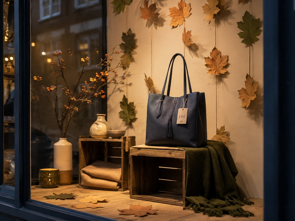
A coordinated finish and a deliberate composition can matter more than an expensive material. Put suitable product supports beneath decorative surfaces, and spend where durability or safety requires it. The table below maps expensive visual effects to their budget-friendly equivalents.
| Desired Effect | Expensive Approach | Budget Alternative | Budget item to check | The Trick |
|---|---|---|---|---|
| Marble / stone pedestals | Custom-cut marble plinths | High-density foam blocks + stone-effect spray paint + matte sealant | Block size, coating, and support | Test the finish on an offcut before coating the full prop |
| Metallic / brass fixtures | Brass display stands | PVC pipe + gold/copper spray paint + wooden base | Pipe, base, and finish | Lightly sand and apply two thin coats; thick coats drip |
| Wooden risers & platforms | Custom woodworking | Wooden crates from produce markets, sanded and stained | Sourcing and preparation | Choose matching or varied crates deliberately to suit the theme |
| Fabric backdrop draping | Designer fabric by the yard | Canvas drop cloths (hardware store) + fabric dye | Cloth size and dye coverage | Test dye on a sample and finish visible edges neatly |
| Oversized art / signage | Large-format printing | Hand-painted kraft paper or cardboard letters | Paper, paint, and fixing | Imperfection is the point. Handmade lettering feels boutique, not budget. |
| Glass display domes | Antique glass cloches | Thrifted glass jars, fishbowls, or vases turned upside down | Sourcing and safe handling | Clean glass thoroughly; fingerprints destroy the illusion |
Ask local suppliers whether clean reusable crates or offcuts are available, rather than assuming discarded materials can be taken. Audit your own storage for fabric, frames, and leftover finishes. Inspect everything for condition and suitability.
Price the actual quantities locally: dimensions, paint coverage, labor, and installation materials can change the total substantially. Check the load capacity and stability of every product support; lightweight decorative materials should not be used as structural supports unless designed for that purpose.
Build a Window Display Calendar and Measure What Changes
A display calendar connects creative ideas to merchandise availability, production, installation, and review. Start with your collection launches, important local events, and seasonal campaigns, then fill the gaps with simpler product refreshes.
A Six-Month Window Display Calendar You Can Adapt
The following is an illustrative January-to-June plan for a Northern Hemisphere lifestyle store. Shift the seasons and dates to match your market. Assign an owner to each row and check stock before committing to the theme.
| Month / theme | Hero product | Props and content | Installation / review |
|---|---|---|---|
| January: Everyday reset | Storage basket collection | Neutral risers, labeled home vignette | First trading week / review after two weeks |
| February: A gift with a story | Maker-made mugs | Paper hearts, maker portrait, gift pairing | Before gifting peak / check stock weekly |
| March: Botanical study | Planters | Existing risers, green backdrop, plant care code | Spring collection arrival / compare enquiries |
| April: Slow weekend breakfast | Tableware | Small table, linen, coordinated bundle | Before local holiday / review bundle sales |
| May: Meet the local maker | Local accessories | Artist panel, materials, demonstration date | Before event / track attendance and sales |
| June: Coastal picnic | Outdoor dining set | Woven baskets, blue accent, short product video | Summer launch / review entry rate |
Work backward from installation. Allow time to approve the theme, confirm stock, acquire props, create screen or print content, and test the arrangement. Custom fabrication needs a supplier-confirmed lead time; the simple refresh schedule for an independent shop should not be assumed to suit a complex multi-store installation.
Refresh the Message Without Rebuilding Everything
Keep a reusable foundation of risers, backdrops, lighting, and neutral props. Change the hero, accent color, seasonal objects, and message as the campaign evolves. The “80/20 refresh” is a helpful reminder to reuse more than you replace, rather than a literal measurement of every installation.
Photograph completed windows and store the setup notes with a prop inventory. Label containers by theme or material, record what needs repair, and keep spare fasteners and printed labels. This makes the next change practical for whichever team member is responsible.
A major refresh every few weeks may suit a store with frequent new arrivals, while another business may build around key seasons. Inspect the window routinely for faded signs, dust, failed lights, missing products, and expired offers even when the overall theme stays in place.
Track Entry Rate, Featured Sales, and Useful Engagement
- Entry rate: count entrants and passersby during matched observation periods. Divide entrants by passersby. This helps distinguish a better display from a busier street.
- Featured-product performance: compare units sold and margin over similar periods, noting discounts, availability, and other advertising. Increased sales during a campaign do not isolate the window’s effect.
- Engagement: record campaign QR visits, bookings, product enquiries, and customer photographs where relevant. Look for actions that support the campaign objective.
For example, 20 entries from 200 passersby is a 10% entry rate; 30 from 300 is also 10%. More visitors alone would not show improved conversion. Use consistent sampling, note weather and events, and review more than one observation before changing direction.
Frequently Asked Questions About Window Displays
What makes a good retail window display?
A good display communicates a clear product or story, creates a focal point, and gives the viewer a reason to enter or learn more. Appropriate lighting, legible messaging, and a consistent store experience matter as much as props. Judge it from outside, under the conditions customers actually see.
What are the best boutique window display ideas for a small space?
Start with a single hero product, a compact lifestyle scene, a color-led arrangement, or a paper backdrop. Use height changes and a limited supporting selection. Small windows benefit from a clear composition; narrowing the concept is often more useful than fitting in additional products.
How can I create a display on a limited budget?
Reuse sound risers and lighting, source clean secondhand props, and choose one inexpensive material to repeat. Plan the finished color palette before buying supplies. Include staff time, installation materials, and future storage in the budget so a low purchase price does not conceal a labor-intensive design.
How often should window displays be changed?
Match major changes to product arrivals, local events, and seasonal campaigns. Between installations, update sold-out merchandise, expired offers, and tired details promptly. Repositioning one hero or changing an accent can freshen a familiar storefront without replacing the entire setup.
Should a window display show prices?
Show prices when they help explain an offer or help customers decide whether to enter. Keep product associations and qualifying conditions clear. Some brand-led scenes use little text, but shoppers should still have an easy route to product information inside or through a relevant digital link.
Can I use an ordinary TV in a shop window?
Do not assume it is suitable. Check daylight visibility, direct-sun exposure, operating temperature, orientation, daily usage, and warranty conditions. A commercial display designed for the installation may be more appropriate. Ask the supplier to assess the actual window and test representative content before rollout.
How do I know whether the display is working?
Choose a goal before installation and compare matched periods afterward. Entry rate, featured-product sales, bookings, and campaign visits can all be useful. Record stock, promotions, weather, and events to avoid crediting the window for changes caused by something else.
Turn Your Chosen Idea into a Working Display
Turn your chosen window display ideas into a practical plan: sketch the arrangement around available merchandise and decide how you will measure the result. Use a reusable structure, test the display from the pavement, and keep the featured products and messages consistent inside the store. Each installation then gives you practical evidence for the next one.

 English
  Russian
  Spanish
  German
  Arabic
  French
  Bulgarian
  Polish
  Romanian
  Turkish
  Portuguese