


Shelf Price Tag Design — A Complete Guide to Labels That Sell
What Makes a Shelf Price Tag Well-Designed
Walk into an unfamiliar supermarket. You’re looking for a jar of pasta sauce. Can you find the price in under three seconds?
If the answer is no, the shelf label has failed. Not because it lacks color or uses the wrong font, but because it wasn’t designed around how customers actually read a shelf. Good shelf price tag design is not about making things “look nice.” It’s a functional discipline governed by three conditions: readability (the price is legible at arm’s length), consistency (every tag across the store follows the same visual logic so customers don’t re-learn where to look in every aisle), and call-to-action clarity (the tag tells the customer what to do next: buy at this price, compare per-unit cost, or scan for more information).
These three conditions form the evaluation framework for every design decision that follows. If a design choice doesn’t improve readability, consistency, or action clarity, it’s decoration. And decoration has no place on a working shelf edge (NIST SP 1181, 2025).
Before any design decision, ask: Does this improve readability? Consistency? Action clarity? If the answer to all three is no, it’s decoration. Cut it.
Visual Hierarchy: Layout, Typography, and Color That Convert
A well-designed shelf price tag isn’t a flat surface of equal-weight information. It’s a carefully weighted visual architecture, and the weight distribution follows a single rule: the customer’s decision journey — from identification to price evaluation to deeper comparison — must flow naturally across four information zones.
Those four zones are Product Identity (name, size, variant), Retail Price (the “You Pay” number), Unit Price (cost per ounce, pound, or liter), and Auxiliary Information (barcode, SKU, QR code). They occupy the same physical label, but they do not carry equal visual weight. The largest, boldest element must always be the price. Everything else exists to support it.
Information Architecture — The Four-Zone Layout Rule
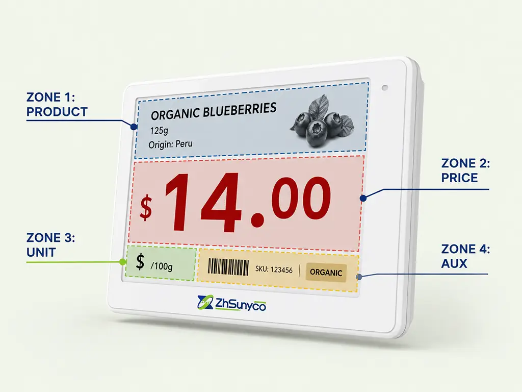
The four-zone model, refined in the NIST SP 1181 unit pricing design standard (2025), provides a reliable starting point for any shelf price tag design project.
Zone 1 — Product Identity. This sits at the top of a standard 100 × 30 mm shelf rail label and contains the product name, size, and variant. It should be readable but never compete with the price for attention. Sans-serif, regular weight, roughly 10–12 pt. Enough for a customer standing in the correct aisle to confirm “yes, this is the product I’m looking at.”
Zone 2 — Retail Price. This is the dominant element, occupying roughly 40–50% of the label’s visual real estate. NIST recommends a minimum price font height of 25.4 mm (1 inch) on sale signs. On a standard shelf tag, the price number should be at least 2× the font size of any other text element. Bold, black on white, centered. If a customer sees nothing else on the label, they must see the price.
Zone 3 — Unit Price. This is the comparison tool. The price per ounce, pound, kilogram, or liter lets customers evaluate value across brands and pack sizes. NIST specifies it should appear on a visually distinct background — a light color block that differs from the retail price area — and the font must be at least 50% of the retail price height. The connector word is always “per”: “$1.99 per lb,” never “$1.99/lb.” This small detail reduces cognitive friction measurably.
Zone 4 — Auxiliary Information. Barcode, SKU, QR code, and any regulatory markings live here, at the bottom, in the smallest type size the format allows. They’re for staff and systems, not customers. The most common design mistake in this zone is letting the barcode grow too large and compete with the price for visual dominance.
Think of this layout like a weather app on your phone: the temperature number is enormous, the weather icon is medium, and humidity and wind speed are tiny. You scan it in half a second and know what you need. A shelf label should work the same way.
Typography and Readability — Fonts, Sizes, and Contrast That Work at Arm’s Length
Typography on a shelf label answers one practical question: can a customer standing in the aisle read it? The answer depends on three variables — font family, size, and contrast — and all three are constrained by viewing distance.
Font family. Sans-serif only. Arial, Helvetica, Roboto, Montserrat — any clean geometric sans-serif works. Serif fonts like Times New Roman or Georgia create visual noise at small sizes and under store lighting. Use no more than two font families per label, and reserve bold weight exclusively for the price.
Font size and viewing distance. A standard supermarket aisle puts the customer 50–100 cm from the shelf edge. At 1 meter, a 16 pt font is the bare minimum for body text; the price number should be at least 24 pt, roughly 2× the size of supporting text. If your labels feel cramped, the fix is almost never a larger label. It’s removing unnecessary information to give the price room to breathe.
Contrast. The WCAG 2.1 accessibility standard sets the floor: a minimum contrast ratio of 4.5:1 for AA compliance, and 7:1 for AAA. Pure black (#000000) on pure white (#FFFFFF) achieves a 21:1 ratio, far exceeding both thresholds. This isn’t just about accessibility compliance. Retail lighting is inconsistent — a label legible under perfect office lighting may wash out completely under a flickering fluorescent tube in aisle 7. High contrast is your insurance against bad lighting.
A quick field test: stand at the farthest natural browsing distance from your shelf, squint slightly, and try to read a price. If you can’t, neither can your customers.
Color Strategy — When and How to Use Color for Maximum Impact
Color is the scarcest resource in shelf price tag design — and the most frequently misused. The principle is simple: color signals change. If every label on every shelf uses color, color signals nothing. Reserve it exclusively for moments that deviate from the baseline.
Layer 1 — The Everyday Baseline. Black text on a white background. This is the design for 90% of the products in your store. High contrast, zero distraction, maximum trust. Customers shouldn’t notice the label design at all. They should notice the price.
Layer 2 — Promotional Signals. Yellow (#F5C452) and red (#BF0002) are the retail industry’s universal attention colors, but they must be used correctly. Yellow works as a background (dark text on a yellow block), not as text. Yellow text on white achieves a contrast ratio of only 2.1:1, failing every accessibility standard. Red works as both a text accent and a price highlight, achieving roughly 5.3:1 on white — just above the AA threshold. Reserve these two colors exclusively for sale, clearance, and limited-time-offer labels. A customer who sees a yellow tag should know immediately: this is a deal.
Layer 3 — Category Navigation. For larger stores, assign a single consistent background tint to each department: light green for organic produce, pale blue for dairy, soft beige for bakery. This isn’t for the individual label; it’s for the shelf as a whole. A customer walking past can identify the department by color before reading a single word. The key discipline: use the same tint for every label in that department, and never let it interfere with price contrast.
If you’re designing for electronic shelf labels (ESLs), you have an additional tool. Four-color e-paper displays — black, white, red, and yellow on a single screen — became commercially available in 2024. This lets you program promotional color schemes into digital tags without printing separate labels, adding a fourth dimension to your color strategy that paper tags cannot replicate.
Paper Tags vs. Electronic Shelf Labels — Design Thinking Across Formats
The design principles covered so far — information hierarchy, contrast ratios, color discipline — are format-independent. A well-designed paper label and a well-designed ESL screen follow the same visual logic. But the two formats differ in one fundamental way: paper is a single frozen moment; electronic is a timeline.
That difference doesn’t replace your existing design skills. It extends them.
What Stays the Same — Universal Design Principles Across Formats
Three core principles carry over from paper to digital without modification.
First, information hierarchy is format-agnostic. The price must dominate, whether it’s printed on thermal paper or rendered on an e-ink screen. The four-zone layout model applies equally to both. Only the rendering technology changes.
Second, contrast standards don’t change. The WCAG 4.5:1 minimum applies to e-paper displays just as it applies to printed labels. E-ink screens — which are reflective rather than emissive, like a Kindle rather than an iPad — perform exceptionally well under bright retail lighting, often outperforming paper in direct sunlight readability. And because e-ink is bistable (it consumes zero power when displaying a static image), your labels stay sharp without constant energy draw.
Third, the customer’s eye works the same way. The “three-second rule” — a shopper must locate the price within three seconds of looking at the shelf — doesn’t change because the label is digital. The visual grammar of retail is independent of the display medium.
What Changes — New Design Possibilities with Digital Labels
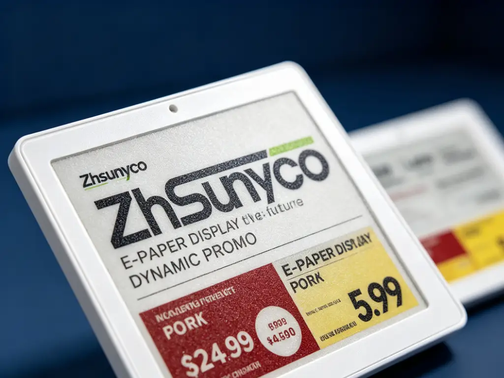
Where ESLs diverge from paper is in adding a dimension paper can never have: time.
Dynamic pricing schedules. A digital label doesn’t have one design. It has a design for every hour of the week. You can program a tag to display the standard black-on-white layout at regular price, then automatically switch to a red-highlighted promotional layout during weekend sales, then revert on Monday morning. This isn’t just a cost-saving measure — though it dramatically reduces the labor of manual tag changes. It’s a design strategy: your labels become seasonally responsive rather than static.
QR codes turn labels into portals. A QR code measuring at least 0.8 × 0.8 inches (roughly 20 × 20 mm) on an ESL screen is scannable from a comfortable distance. That code can link to product origin stories, usage instructions, complementary product suggestions, or loyalty program enrollment — converting the label from a passive price display into an active customer engagement channel. The GS1 Digital Link standard is driving the industry toward full 2D barcode adoption by 2027. Soon, every digital label will function as a bridge between the physical shelf and the online experience.
Multi-color flexibility. Four-color ESLs (black, white, red, yellow on one screen) let you change not just the price but the entire color strategy remotely. A tag that displays as standard black-and-white during the week can add a yellow promotional block and red price highlight on Friday evening — without anyone touching the shelf.
Making the Transition — A Practical Design Checklist
If you’re considering moving from paper to electronic shelf labels, here’s a five-step checklist to keep your design standards intact through the transition:
- Audit your current labels. Document every label size, layout, font, and color scheme currently in use across your store. You can’t improve what you haven’t measured.
- Separate what stays from what changes. Mark which design elements transfer directly (information hierarchy, contrast ratios, font choices) and which you want to upgrade using digital capabilities (dynamic promotions, QR code integration, color programming).
- Select your tag sizes and communication technology. Match ESL sizes to your existing shelf formats. On the technology side, different radio protocols suit different store layouts: 2.4GHz systems handle large multi-aisle environments well, 433MHz offers extended range for warehouse-scale deployments, and BLE or NFC works best for smaller boutique formats where phone-based interaction is a priority. The protocol choice is one of the most consequential decisions in an ESL deployment — a mismatch can mean dead zones or interference — so it’s worth working with a supplier who covers multiple protocols rather than one locked into a single frequency.
- Design your templates. Create three to five ESL templates — everyday pricing, weekend promotion, clearance, new product highlight, and informational announcement — that share the same underlying grid but vary in color treatment and emphasis.
- Pilot in one category first. Pick a single aisle or department, run the ESLs for a month, collect feedback from both customers and staff, and only then expand to the full store.
Adapting Price Tag Design to Your Retail Environment
The same design principles express differently depending on where the shelf lives. A convenience store label and a hardware store label serve the same function, but the physical environment dictates the execution.
| Store Type | Recommended Label Size | Key Design Consideration | Typical Viewing Distance |
|---|---|---|---|
| Grocery / Supermarket | 2.2″–2.6″ | Unit price compliance display required; standard rail mounting | 50–100 cm |
| Convenience Store | 1.6″–2.2″ | Compact space, price must dominate; frequent promotional switches | 30–60 cm |
| Pharmacy / Health | 2.2″–2.9″ | Extra info fields (dosage, active ingredient); clear info partitioning | 40–80 cm |
| Hardware / DIY | 2.2″–2.9″ | Metal hook mounting with durable adhesive; SKU codes must be scannable | 60–120 cm |
| Apparel / Footwear | 1.6″–2.2″ | Hang tags + shelf labels coexist; brand-consistent styling matters | 30–80 cm |
Beyond size, environment-specific factors matter. Freezer aisle labels need batteries rated for -25°C operation. Hardware store labels mounted on metal peg hooks need specialized adhesive backing — standard paper labels peel within days on metal surfaces. A pharmacy label may need to display a DIN or NDC code in a fixed position that staff can locate without scanning the entire tag.
The simplest way to get sizing right: measure the labels you’re currently using, and match. Standards exist for a reason. Your shelf rails, C-channel holders, and peg hook dimensions are already built around specific label sizes. Don’t redesign the rail; design the label that fits it.
From Design Decisions to Retail Performance
The shelf price tag is often treated as a cost center — something you print, stick, and replace. But design decisions made at the shelf edge ripple through retail operations in measurable ways.
Faster shopping decisions. When a customer can locate the price instantly — because the information hierarchy is clear, the contrast is high, and the layout is consistent across aisles — shopping accelerates. Every second a customer spends hunting for a price is a second of friction. Eliminate that friction, and you eliminate a silent reason customers leave without buying.
Fewer pricing errors. A label that displays price information clearly reduces checkout disputes — the “the shelf said $4.99 but it rang up at $5.49” problem. With paper labels, errors creep in because price changes require physical replacement. With ESLs, the price on the shelf and the price in the POS system are the same data point, updated simultaneously. That single synchronization eliminates the most common source of pricing complaints, and the labor cost of resolving them.
Lower operational overhead. The labor economics of shelf labeling are straightforward: a mid-size supermarket with 20,000 SKUs running weekly promotions might spend 15–20 staff hours per week on manual tag changes. Digital ESL systems reduce that to near-zero. Price updates are pushed from a central management console in minutes, and the reclaimed labor hours move from price tag maintenance to customer service. And because the price is always current, there’s no risk of a customer photographing an expired promotion and demanding the outdated price at checkout.
The next time you look at your shelf labels, don’t ask “Does this look good?” Ask: “Is this helping my customer make a decision in under three seconds?” If the answer is anything other than an immediate yes, your design has work to do.
“The next time you look at your shelf labels, don’t ask ‘Does this look good?’ Ask: ‘Is this helping my customer make a decision in under three seconds?'”
Ready to bring digital precision to your shelf edge?
Explore ESL systems built for your store format — multi-protocol support, four-color displays, and full design customization.
Talk to Our Team
 English
  Russian
  Spanish
  German
  Arabic
  French
  Bulgarian
  Polish
  Romanian
  Turkish
  Portuguese