


Supermarket Price Tag Design: A Practical Framework for Retailers Moving from Paper to Digital
Why Price Tag Design Is a Business Decision, Not Just a Graphic Design Exercise
Walk into any supermarket and count how many times you interact with a price tag. Ten times? Twenty? Fifty? Each glance is a micro-transaction. A split-second decision about whether the price feels fair, whether the product is worth trying, whether you trust this store to be transparent about what things cost.
Now imagine those same tags are inconsistent, faded, or missing entirely. A shopper squints at a shelf, can’t find the price, and puts the item back. Multiply that moment across thousands of daily customer interactions, and the revenue leakage becomes real.
Price tag design is not a graphic design exercise. It is an operational decision that directly affects pricing accuracy, regulatory compliance, and customer trust. Industry estimates suggest that in a paper-tag system, anywhere from 5% to 10% of shelf labels carry errors at any given time. These errors include prices that don’t match the POS system, missing unit prices, and illegible numbers. They don’t just annoy customers. They create disputes, erode trust, and in regulated markets, expose the business to fines.
The good news: good price tag design is neither expensive nor complicated. It follows a set of clear, learnable principles. And whether you’re running a single independent grocery or a 100-store chain, getting these principles right is one of the highest-ROI improvements you can make to your store operations.
Information Architecture — What Goes on a Price Tag and in What Order
Every price tag only needs to answer three questions for a shopper: How much does this cost? Is it a fair price per unit? What product am I looking at? If your labels can’t deliver those three answers within three seconds of a customer glancing at the shelf, the design has failed.
This “three-second test” is the foundation of everything that follows. Before you choose fonts or colors, you need a clear information hierarchy — a deliberate decision about what information gets visual priority and what gets pushed to the background.
The Four-Level Information Hierarchy Every Price Tag Needs
Think of a price tag like a newspaper front page: the most important story gets the biggest headline. On a shelf label, the hierarchy runs through four distinct levels, each with a specific job.
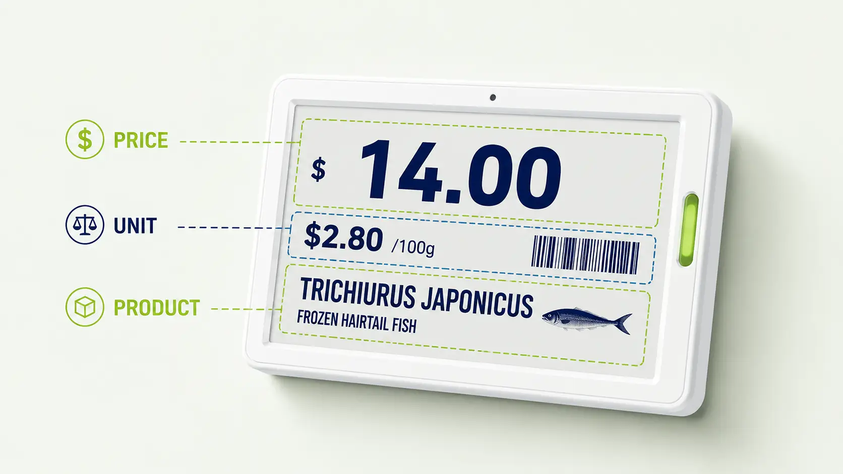
Level One: The Selling Price. This is the undisputed king of the tag. It should use the largest font size on the label — a minimum of 14pt for standard shelf-distance viewing — and be the first thing the eye lands on. Bold weight, positioned prominently. If a customer sees nothing else, they see the price.
Level Two: The Unit Price. This sits immediately adjacent to the selling price — close enough that the eye reads them as a pair — but visually distinct. Best practice is to place the unit price in a subtly different background block (a light tinted rectangle behind the unit price text) so shoppers instantly recognize it as comparison information. Per NIST SP 1181 (2025), the unit price character height must be at least 6mm on physical shelf labels, and its font size should be no less than 50% of the selling price font size.
Level Three: Product Name and Specification. The product identifier — brand name, variety, and net weight or volume — needs to be scannable but subordinate. It supports the price; it does not compete with it. One to two lines maximum, in a smaller weight.
Level Four: Auxiliary Information. Barcodes, internal SKU codes, promotional date ranges, and other operational data live at the bottom or edge of the tag in the smallest legible type. These are for staff and systems, not for customers — so they get the least visual real estate.
To test whether your current tags respect this hierarchy, try this: stand at arm’s length from a shelf, squint slightly, and see what you read first. If it isn’t the price, the hierarchy is inverted.
Unit Pricing — The Most Overlooked Compliance Element in Tag Design
Many retailers treat unit pricing as a box-ticking exercise — something the law requires but nobody really reads. That assumption is wrong on two levels.
First, consumers do read unit prices. A CHOICE Australia survey found that 38% of shoppers report inconsistent measurement units as a major frustration when comparing products — one cheese labeled per 100g, another per kilogram, making direct comparison impossible without a calculator. This isn’t a minor inconvenience; it’s a market failure at the shelf edge. When customers can’t compare, they default to the familiar brand, not the best value — which hurts both price-conscious shoppers and smaller suppliers.
Second, regulators are paying attention. Australia is currently reforming its Unit Pricing Code in 2025 with stronger penalties for non-compliance. In the United States, NIST requires unit prices to be “clear, prominent, conspicuous, and non-deceptive.”
Three non-negotiable rules for unit price design:
- Unified measurement units within each product category. Every beverage on the aisle uses the same unit — “per fl oz” or “per 100ml,” not a mix of both.
- Visual separation from the selling price. A different background tint block ensures shoppers process the unit price as comparison data, not as a duplicate of the retail price.
- Unit pricing even when it equals the selling price. If a single-serve item costs $1.49 and the unit price is also $1.49 per each, the unit price still appears. Shoppers need it to compare against multi-packs of the same product.
The Science of Shelf-Edge Readability — Typography, Color, and Contrast
The best shelf-edge design is invisible. Customers shouldn’t notice the tag — they should absorb the price and move on. Every typography and color decision either serves that goal or undermines it.
Typography Rules That Actually Work at Shelf Distance
Typography mistakes are the most common — and most easily fixed — design failures on supermarket shelves.
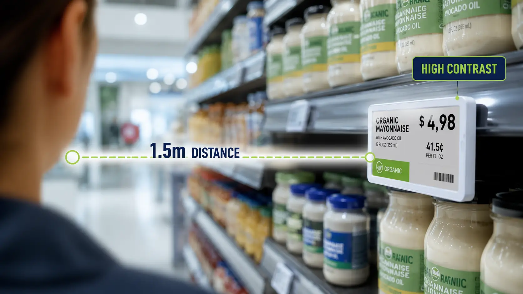
Font selection. Sans-serif fonts are the only correct answer for shelf labels. Arial, Helvetica, and Roboto render cleanly at small sizes, maintain legibility under fluorescent lighting, and don’t introduce decorative elements that blur at a distance. Serif fonts like Times New Roman, and especially decorative or condensed display faces, lose clarity when viewed from a meter away. Limit yourself to a maximum of two font families per tag — one for the price, one for everything else.
Size and distance. A practical formula: minimum readable character height in millimeters ≈ viewing distance in centimeters × 0.15. At a typical shelf viewing distance of 0.5 to 1.5 meters, this means price digits should be at least 7.5mm to 22.5mm tall. For bottom-shelf or top-shelf positions where the viewing angle is steeper, add 20–30% to the size.
Contrast. The Web Content Accessibility Guidelines (WCAG) 2.1 AA standard sets the benchmark: a minimum contrast ratio of 4.5:1 for normal text and 3:1 for large text (18pt or 14pt bold and above). Black text on a white background easily exceeds this at roughly 21:1. Under supermarket fluorescent lighting at 500–750 lux, high-contrast labels maintain roughly 40% better readability than low-contrast alternatives — a measurable difference in how quickly shoppers find prices and how accurately they read them.
Test this yourself: Print two versions of the same price — one in Arial 14pt bold, one in Times New Roman 12pt regular. Tape both to a wall, step back three paces, and see which one you read first. That’s exactly what your customers experience at the shelf.
Color-Coding Systems — When They Help and When They Hurt
Color is the most powerful visual tool on a price tag. It’s also the easiest to misuse.
In retail, certain colors carry nearly universal psychological signals. Red means discount, urgency, or reduced price. Yellow draws attention and signals value. Green suggests natural, organic, or eco-friendly. The critical rule: one color, one meaning, across the entire store. If red sometimes means “on sale” and sometimes means “new arrival,” customers stop trusting either signal. Color discipline must be enforced at the chain level, not left to individual store managers.
Design your color system in three steps. First, define the categories you need to visually distinguish — typically regular price, promotional price, and clearance. Second, assign one unique color to each category. Third, lock that mapping across every store in the chain.
Two important caveats. About 8% of men have some form of color vision deficiency, with red-green being the most common type. Red should never be the sole indicator of a promotional price — always pair it with a text label like “SALE” or a positional cue. And yellow paired with black text produces the highest contrast ratio of any color combination (approximately 21:1), which is why the “yellow sale tag” is a global retail convention that predates modern supermarkets by decades.
A quick sanity check: Remove all color from your tags and look at them in grayscale. Is the information still clear? If not, color is carrying weight it shouldn’t bear. Color should reinforce meaning, not create it.
From Paper to Pixels — How Digital Price Tags Change the Design Equation
Moving from paper price tags to electronic shelf labels doesn’t mean abandoning good design. It means applying the same principles to a far more capable medium. Everything you’ve learned about information hierarchy, contrast, and color consistency still applies. Digital tags simply give you tools to execute those principles with speed and precision that paper can never match.
What Stays the Same — Core Design Principles That Carry Over
Three fundamentals survive the paper-to-digital transition unchanged.
First, information hierarchy remains paramount. The selling price must still dominate the display. The difference is that digital tag software enforces this hierarchy through templates. Once designed correctly, no store associate can accidentally enlarge the product name and shrink the price.
Second, contrast requirements don’t go away. E Ink displays — the screen technology used in most electronic shelf labels — achieve a typical contrast ratio of about 15:1. That’s lower than black ink on white paper but still more than triple the WCAG AA standard of 4.5:1. Under supermarket fluorescent lighting, E Ink performs comparably to paper in terms of readability. In dimmer environments like freezer aisles, it actually outperforms paper because it doesn’t rely on reflected external light alone.
Third, brand consistency becomes easier, not harder. With paper tags, the best-designed template in the world is only as good as the store associate who prints and places it. Digital tags use a centralized template system. One design update propagates to every label in every store simultaneously.
What Gets Better — New Capabilities Digital Tags Unlock
Digital tags solve design problems that paper tags can’t address at all.
Dynamic pricing with visual state switching. A promotional price has a start date and an end date. On paper, that means two rounds of manual label changes — once to put the sale tag up, once to take it down. Miss a change, and customers see expired promotions at the shelf. Digital tags switch between “regular” and “promotional” display templates automatically, triggered by the system clock. This means your tag design needs to account for two visual states per product — something paper designers never had to consider.
Richer information without visual clutter. A 2.9-inch electronic shelf label can display far more than a price. QR codes linking to product origin stories or recipe suggestions. Icons indicating SNAP or WIC eligibility. LED indicators that flash to guide staff to items for online order picking — a feature that can cut fulfillment time by 30–40%. The design challenge becomes curation: what additional information genuinely helps the shopper, and what just adds noise? The four-level hierarchy framework from earlier in this article becomes even more important when you have more information competing for limited screen space.
Instant chain-wide consistency. The single biggest design failure in retail is the gap between headquarters’ intentions and store-level execution. A beautifully designed tag template means nothing if Store #47 is still using last quarter’s version, or if Store #12’s printer is running low on toner and all the tags look washed out. Digital tags eliminate this gap entirely: the template lives on a server, and every tag in every store renders the same design.
The scale of this transition is enormous. Walmart is deploying electronic shelf labels across all 23,000 of its U.S. stores. Aldi has installed over 25 million ESL units across more than 7,500 stores globally. UK grocer Morrisons rolled out 10.8 million labels across 497 locations. This isn’t a pilot program anymore. It’s the new standard for shelf-edge infrastructure.
Designing the ESL Display Layout — A Practical Framework
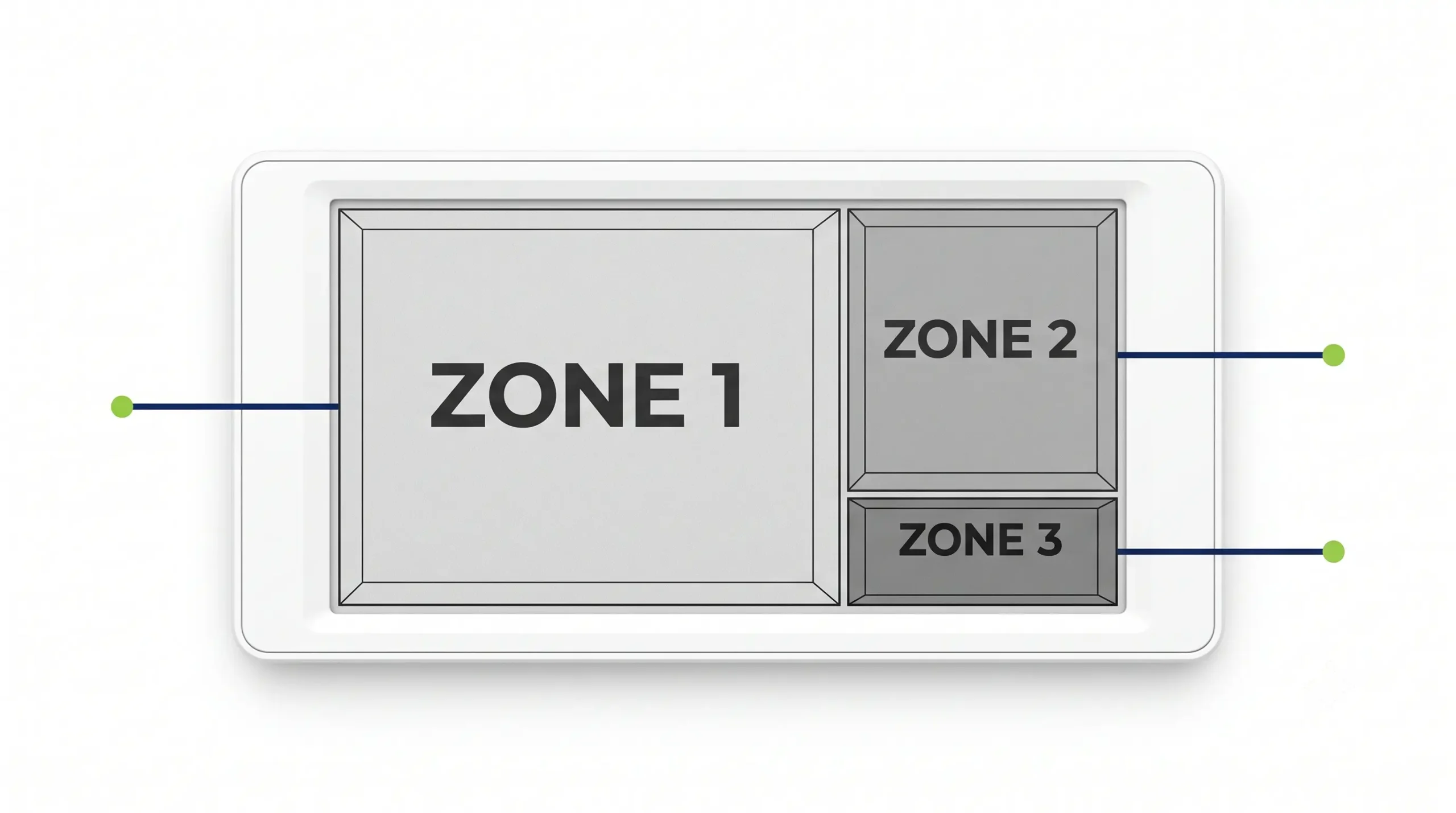
If you’re deploying electronic shelf labels, you need a display layout framework that works across different tag sizes and product categories. Here is a practical “three-zone” approach that adapts the paper-tag design principles to the digital screen.
Zone 1: Primary Information (60–70% of screen area). This zone contains the selling price in the largest available font and the unit price immediately adjacent, rendered on a subtly tinted background block. On a typical 2.9-inch E Ink display with a resolution of 296 × 128 pixels, allocate roughly 180 × 90 pixels to this zone to ensure the price digits remain crisp and instantly legible.
Zone 2: Secondary Information (20–25%). The product name — one or two lines maximum — and the net weight or volume. On smaller screens (2.13 inches), the product name may need to be abbreviated. On larger screens (4.2 inches and above), you have room for an additional descriptor line.
Zone 3: Functional Indicators (10–15%). This is where conditional elements appear: a red or yellow corner badge for promotional pricing, a QR code for extended product information, a SNAP/WIC eligibility icon, and an LED indicator position for pick-to-light functionality. The key design rule: Zone 3 elements should appear only when relevant, not sit as permanent blank space holders.
A “minimal layout” (for 2.13-inch tags on fast-moving commodity items) might show only price plus product name. A “full layout” (for 2.9-inch and larger tags on premium or promoted items) would include price, unit price, product name, a QR code, and an active promotion badge — all within the same three-zone architecture.
Implementing this framework in the real world comes down to the software that drives the tags. The best ESL platforms let you define display templates centrally, test them across different screen sizes, and push changes to every label in the chain with a single action. When evaluating providers, one of the most overlooked criteria is the flexibility of the template editor. Zhsunyco®, for example, offers a software platform with fully customizable display templates and user interfaces, letting retail chains adapt the three-zone framework to their own brand guidelines and product categories. Before committing to any ESL system, ask to see the template design tool and test whether it can execute the design decisions you’ve made.
Common Price Tag Design Mistakes That Cost You Sales and Trust
The best design education comes from studying failures. Here are the seven most common price tag design mistakes, what each one costs your business, and how to fix it. Use this as a checklist on your next store walk-through.
| Mistake | Business Consequence | Fix |
|---|---|---|
| Price font too small to read from shelf distance | Shoppers abandon products; basket size shrinks | Selling price minimum 14pt bold; add 2.5mm character height for every additional meter of viewing distance |
| Unit price missing or using inconsistent measurement units | Regulatory risk plus shoppers cannot compare value | Standardize one unit per product category; unit price on every tag, even when equal to selling price |
| Promotional colors (red/yellow) used for regular-price items | Shoppers become desensitized to real promotions | Reserve red and yellow exclusively for discounts; enforce color discipline across all stores |
| Shelf tag price doesn’t match POS system | Customer disputes, refunds, permanent trust damage | Digital (ESL) systems eliminate this; paper systems need daily spot-check audits |
| Too much information crowding the tag | The price — the only thing most shoppers want — gets buried | Enforce the four-level information hierarchy; remove auxiliary data not essential for the shopper |
| Decorative or serif fonts | Price digits blur together at shelf distance | Sans-serif only (Arial, Helvetica, Roboto); never more than two font families per tag |
| Inconsistent tag placement or tags blocked by product overhang | Customers can’t locate the price at all | Standardize tag position on shelf rail; train staff to check sightlines after restocking |
Good price tag design isn’t a one-time project. It’s an ongoing discipline. The most successful supermarket chains treat shelf-edge design as part of their quarterly operational audit, right alongside inventory accuracy and mystery shopper scores. Whether you’re running paper tags today or planning a digital transition, the principles in this article give you a framework to measure, improve, and maintain what is arguably the most valuable square inch of real estate in your entire store: the space between your product and your customer’s eyes.

 English
  Russian
  Spanish
  German
  Arabic
  French
  Bulgarian
  Polish
  Romanian
  Turkish
  Portuguese