


Creative Retail Display Ideas for Shops and Supermarkets
Looking for creative retail display ideas that fit your products, space, and budget? Start with a clear focal point, then choose a display format that helps shoppers understand what to buy and why. Whether you run one small shop or several supermarkets, the goal is to make the merchandise easier to notice and explore.
You need fresh ideas. But more than that, you need ideas that translate into revenue — and a system that keeps them fresh without burning out your team.
This guide covers storefronts, shelves, tables, and counters, with practical examples for small shops and supermarkets. Use the quick-reference table to choose a starting point, then explore the creative techniques and digital tools that can help you maintain the display.
Retail Display Ideas at a Glance
Choose retail display ideas according to the merchandise, available space, and time your team can spend maintaining them. Start with one area before extending a format throughout the store.
| Display idea | Suitable setting | How to start | Keep in mind |
|---|---|---|---|
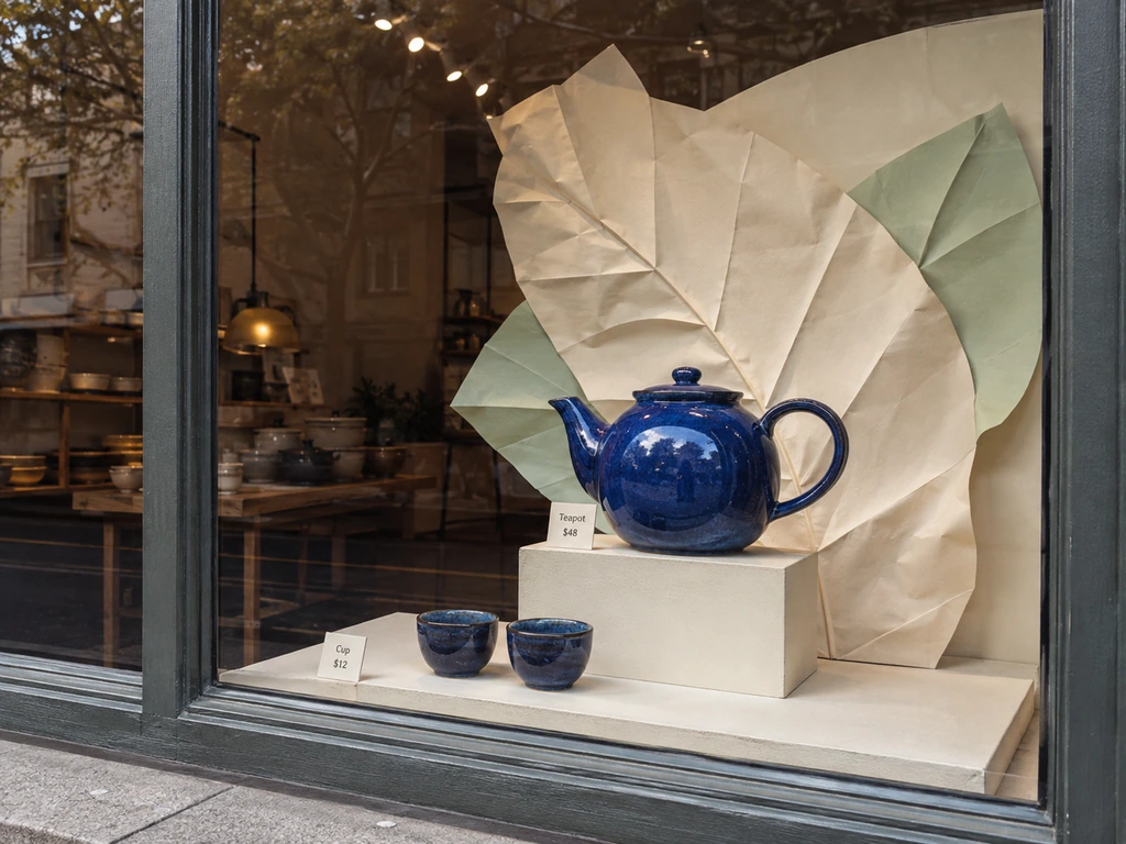
| One hero product | Shop window or entrance | Raise one item against a simple backdrop and light it clearly. | Keep supporting props from hiding what is for sale. |
| Vertical layers | Small shop or narrow wall bay | Use stable tiered risers or adjustable shelves. | Keep products reachable and walkways clear. |
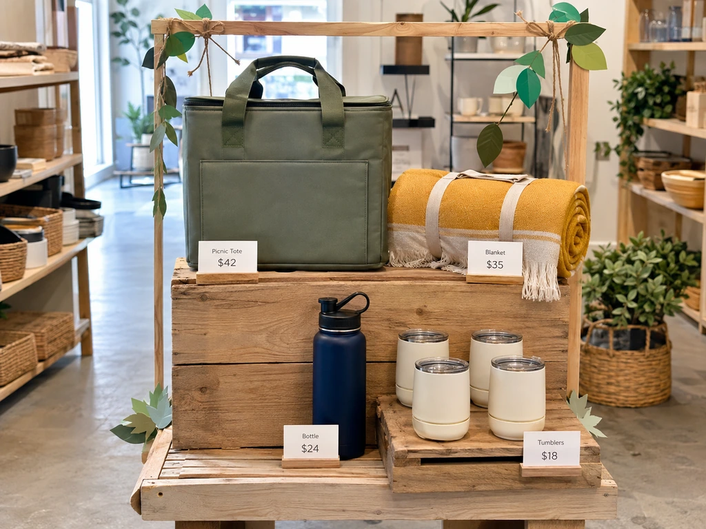
| Lifestyle grouping | Gift, fashion, homeware, or grocery store | Combine complementary products around one occasion. | Make each item’s price and purpose clear. |
| Color blocking | Apparel, beauty, or packaged products | Group related shades around a contrasting focal item. | Preserve useful category and size organization. |
| Reusable seasonal scene | Window, table, or entrance display | Keep neutral supports and change the theme, accents, and products. | Plan stock availability and storage for reusable props. |
| Counter add-ons | Checkout or service counter | Offer a small selection that complements the main purchase. | Leave room for payment, packing, and customer service. |
| Promotional end cap | Grocery aisle or destination bay | Bring a meal or occasion together with one clear offer. | Check replenishment, offer dates, and storage needs. |
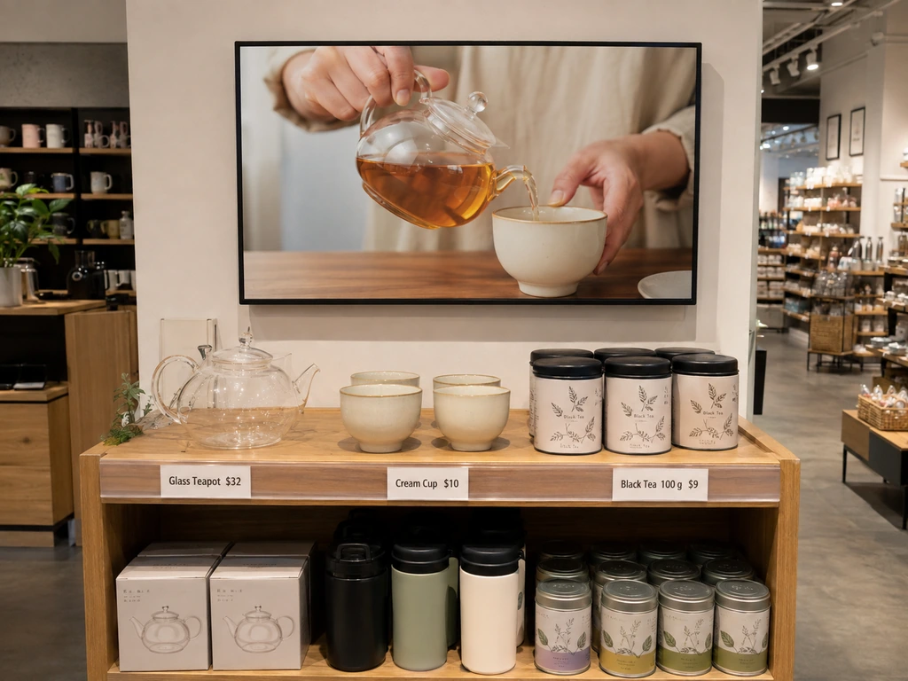
| Screen plus merchandise | Product feature, shelf, or demonstration area | Show the product in use beside the physical item. | Match the message to the stock and keep content current. |
Storefront and Window Display Ideas That Stop Foot Traffic
The numbers are humbling: a passerby gives your window roughly three seconds at walking pace before their eyes move on. In that time they need to register what you sell, decide it’s relevant, and feel enough curiosity to take one more step toward the door.
That sounds punishing, but it also clarifies what matters. The most effective window displays share three principles:
One focal point, ruthlessly enforced. Anthropologie, long the gold standard for creative window displays, lets each store’s in-house artist build elaborate handmade installations — but every single one orbits a single idea. A pond scene with oversized sculptural waterlilies. A wall of upcycled book pages folded into flower petals. The detail rewards the person who stops; the singular concept catches the person who doesn’t.
Design for the phone, not just the footpath. A window display in 2026 is also a social media backdrop. The question isn’t just “does this look good from the sidewalk?” — it’s “would someone take a photo of this?” Build in one Instagram-ready detail: an unexpected texture, a clever shadow, a color contrast that pops on a phone screen.
Low budget doesn’t mean low impact. Vinyl decals that wrap the window can create symmetry, depth, and seasonal relevance for a fraction of what a physical installation costs. Oversized props made from lightweight honeycomb board — the same technique that drove a 4,711% sales uplift for Jordans cereal in Waitrose — prove that structural creativity beats structural budget every time.
The point isn’t to replicate Anthropologie’s art-department budget. It’s to apply the same discipline: one idea, executed with conviction, designed to be seen in three seconds and remembered for longer.
Merchandise Display Ideas for Shelves, Tables, and Counters
Practical merchandise display ideas make products easier to notice, compare, and combine. Start with height, grouping, and lighting, then adapt the arrangement to the space available. A shelf should help customers understand the selection, while a table or counter can bring a focused product story into view.
Vertical Displays and Space Maximization
Most stores use roughly 60% of their available display real estate. The zone between knee height and eye level does all the work; everything above and below becomes visual dead space. The fix is simpler than most retailers think.
Freestanding metal units with interchangeable crates and baskets let you build upward without permanent fixtures. Industrial pipework systems — black powder-coated steel paired with natural wood shelving — create a modern, modular framework that works across categories. Tiered display tables draw the eye upward in stages, turning a flat counter into a journey.
The principle isn’t “fill every inch.” It’s “earn every inch.” If a customer can scan your entire product range without tilting their head, you’ve left opportunity on the table.
Small Shop Display Ideas for Limited Floor Space
For a compact store, use one wall bay or a narrow table to present a focused selection instead of spreading merchandise across every surface. Adjustable wall shelves, stable tiered risers, and a compact freestanding unit can create height variation while leaving the main route through the shop clear. Keep frequently handled products within comfortable reach.
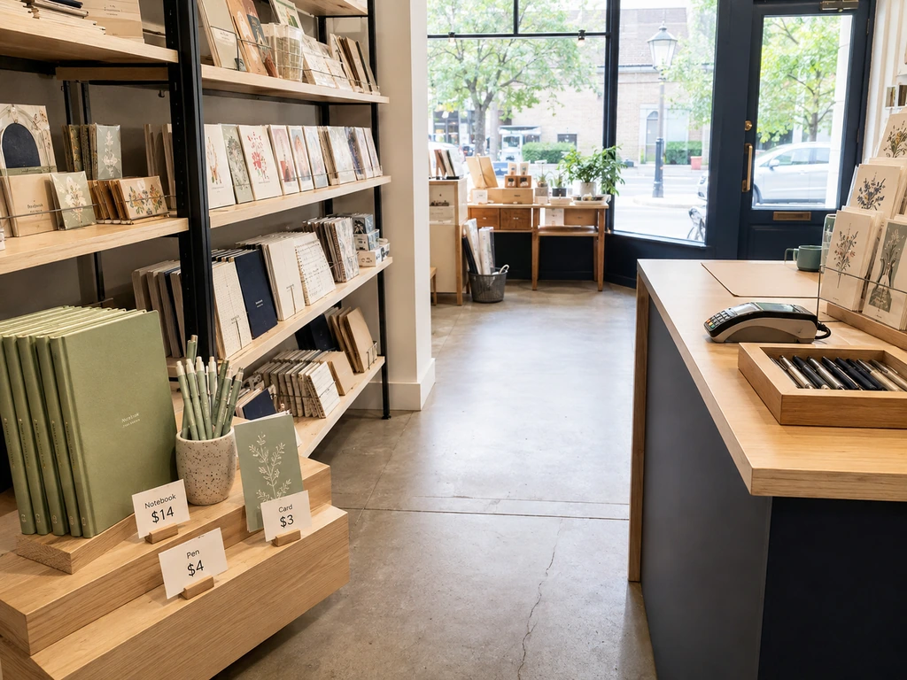
Build around a reusable set of neutral props and rotate the hero product, accent color, and sign. A gift shop might feature a notebook, pen, and card as one writing-themed arrangement. Keep additional colors or stock nearby rather than crowding the feature. Check the display from the entrance and from a seated viewing height.
Retail Counter Display Ideas for Small Add-On Purchases
Useful retail counter display ideas connect a small item to the purchase already being made: shoe-care products beside footwear, greeting cards beside gifts, or tea infusers beside loose-leaf tea. Choose a limited assortment and use a shallow tray or compact riser so customers can see the options and their prices without asking staff to explain the whole display.
Keep the payment terminal, packing area, and accessible service space clear. Avoid tall fixtures that block conversation or obscure the queue. Assign a simple restocking check, remove damaged packaging, and rotate the selection when the featured range changes. Track sales and staff feedback to decide which combinations are worth keeping.
Product Grouping and Lifestyle Storytelling
Most stores organize by category: all the pasta here, all the sauce there. It’s logical. It’s also a missed opportunity.
When you group products around a moment instead of a category — “Weekend Brunch” pulling together artisan bread, small-batch jam, a French press, and cloth napkins — you do two things at once. You make discovery effortless (the customer didn’t know they needed jam, but now it’s right there), and you raise the emotional stakes of the purchase. They’re no longer buying a jar of preserves; they’re buying into a slow Sunday morning.
Whole Foods and Erewhon have turned this into an art form with their “Grab & Go, but Make It Beautiful” tables — single-surface displays that blend wellness, snacking, and hydration into one curated moment. The cross-category format routinely outperforms traditional aisle placement on both dwell time and basket size.
Lighting, Signage, and Sensory Cues
Lighting is the most underinvested display tool in retail. The rule of thumb: spotlight-to-ambient ratios of 3:1 to 5:1 create a focal hierarchy that guides the eye without feeling theatrical. Warm white (2700–3000K) flatters food, fashion, and home goods; cool white (4000–5000K) belongs in electronics, pharmacy, and fresh seafood — where clarity matters more than warmth.
Signage follows a brutal math: one inch of letter height equals roughly 10 feet of readability. A sign that works at the entrance fails at the back of the store. And the content rule is even simpler: one message per sign. Not one message per paragraph — one message, period. The shopper moving through an aisle gives each section roughly three to five seconds of visual attention before their eyes settle or move on.
- Spotlight-to-ambient ratio: 3:1 – 5:1
- Warm white: 2700–3000K — food, fashion, home goods
- Cool white: 4000–5000K — electronics, pharmacy, seafood
- Sign letter height: 1″ per 10 ft of viewing distance
- One message per sign — no exceptions
Unique Retail Display Ideas Through Seasonal Themes and Storytelling
Unique retail display ideas can come from a local story, an unexpected material, or a familiar product shown in a new context. Use a seasonal theme to connect the merchandise and setting, rather than relying only on holiday decorations. A reusable structure lets you change the story without rebuilding the entire display.
Color, Texture, and Material Trends
The brain processes color blocks faster than patterns — which is why color blocking, gradient merchandising, and tone-on-tone groupings consistently outperform busy, multi-pattern displays in both attention metrics and sales. The technique works because it reduces cognitive load: the eye knows exactly where to land, and the product colors pop against each other rather than competing.
On the materials side, the shift toward upcycled and natural textures is both an aesthetic and a positioning choice. Schweppes and Oasis deployed a 100% cardboard archway installation — complete with waterfalls and fruit characters — that was modular, sustainable, and visually arresting. It looked premium without being precious. Wooden crates, wicker baskets, and raw linen add warmth that standard plastic and metal fixtures can’t replicate — especially effective in grocery, lifestyle, and gift retail.
Building Narratives Around Themes, Not Just Holidays
“Christmas in July” was clever once. Now it’s wallpaper. The more durable strategy is thematic storytelling that isn’t chained to a calendar date.
Hong Kong supermarket chain Wellcome transformed two locations into retro time-capsule stores — complete with printed tram-track floor graphics, vintage Coca-Cola crate walls, neon signs, and photo booths. The concept worked because it tapped into nostalgia (a powerful driver for the 25–40 demographic) without needing a holiday as an excuse. Customers came for the experience, stayed to shop, and generated organic social media coverage that no paid campaign could match.
Other durable themes: travel and destination (suitcases, postcards, maps), local community and heritage, and “day-to-night” environments where lighting shifts transform the same display from bright and approachable to warm and intimate as the afternoon fades.
Rotate themes quarterly, make small adjustments every two to four weeks — swap a color accent, update a prop, refresh the signage — and the store never feels stale.
Creative Retail Displays with Digital Screens and Interactive Features
Digital screens and interactive features can support creative retail displays by explaining products, showing them in use, and keeping promotional messages current. Start with the display’s purpose, then select the technology that helps communicate it. The screen, shelf, and physical merchandise should work as one composition.
Digital Screens and In-Store Retail Media
In-store digital screens have crossed the adoption chasm. Grocery TV’s 2026 In-Store Shopper Perception Report — a survey of 1,018 U.S. grocery shoppers — found that 62% of shoppers have purchased a product directly after seeing it on an in-store screen. Entrance, checkout, deli, and pharmacy placements all cleared 84–88% favorability ratings.
What’s on the screen matters as much as where it is. Promotions and current sales rank first in shopper preference (51.5%), followed by product information and recipes (45.4%). Personalized ads rank last — shoppers don’t want their preferences broadcast to the aisle behind them. The winning formula: contextually relevant content that enhances the display rather than interrupting it.
The halo effects are real. One CPG brand tracked a 12% lift across complementary products and an 8% lift across the full brand portfolio from in-store screen campaigns. The screen doesn’t just sell the advertised item — it primes the entire surrounding shelf.
What makes this accessible now is that LCD shelf-edge displays have reached a tipping point on both performance and procurement. High-resolution 2K panels from BOE, LG, and Samsung lines now achieve 50,000-hour lifespans, come in multiple form factors — stretch bar, round, square — and are available at quantities as low as a single unit. A retailer can test one screen at one end cap, measure the lift, and scale from there. No fleet commitment, no integrator lock-in.
QR Codes, AR, and Touch-Free Interactive Experiences
QR codes have completed their pandemic-era rehabilitation. Used well, they extend a physical display into a digital experience — a QR on a cheese shelf links to a recipe video; a code on a skincare display opens a ingredient-origin story; a tag on a jacket launches a virtual try-on.
AR adoption in retail continues to climb, with beauty (L’Oréal’s virtual try-on) and furniture leading the charge. But the principle applies at any scale: the display catches attention, the interaction deepens engagement, and the deeper the engagement, the more likely the purchase.
Electronic Shelf Labels and Smart Shelves as Creative Tools
This is the idea most retailers haven’t had yet: electronic shelf labels (ESLs) aren’t just efficiency tools. They’re creative display tools.
Think about what a traditional paper label locks you into. A price change means someone climbs a ladder, finds the right SKU, peels, replaces, and repeats — across every shelf in every aisle. A thematic color change (say you want all shelf-edge accents to shift from navy to green for a spring refresh) means reprinting every label in the store. No wonder most retailers touch their shelf-level displays once a season, tops.
Now imagine the opposite: every shelf-edge label in your store updates at once from a single dashboard. You run a weekend flash promotion — all promotional items get a flashing LED border and a red price highlight, then revert on Monday morning. You test two different shelf color schemes across two store locations and compare the sales data. Your entire chain runs the same creative display theme without shipping a single piece of paper.
This isn’t speculative. Woolworths has deployed approximately 17 million ESL tags across 600+ Australian stores. The technology has moved from pilot to mainstream, with costs declining roughly 50% in recent years. Modern E-Ink displays support three, four, and now full-color palettes, with battery lives of three to five years. The shelf edge — long the most static surface in the store — is becoming as dynamic as a webpage.
The creative implication is bigger than efficiency. When the cost of changing a display drops to near-zero, the rhythm of creativity changes. You can afford to experiment. You can run seasonal themes at the shelf edge, not just in the window. You can A/B test display strategies the way e-commerce teams A/B test landing pages — and the data tells you what works.
Creative Grocery Store Display Ideas for Fresh Food and Everyday Essentials
Creative grocery store display ideas need to balance visual appeal with stock rotation, replenishment, and clear pricing. Perishable products also need suitable storage conditions. Build the concept around a practical shopping need, then choose fixtures and signage that make the selection easy to understand and maintain.
Fresh Produce and Perishable Display Innovations
The produce section does more to shape a shopper’s quality perception than any other zone in the store. Abundance signals freshness: stacked height, color variation across the spectrum, and visible restocking all communicate “this moves fast, this is fresh.” Natural materials — wooden crates, wicker baskets, burlap liners — add warmth that standard green plastic cannot.
Lighting is especially critical here. Warm white around 3000K makes red meat look vibrant; neutral 3500K keeps produce colors true; cool 4000K lets seafood read as clean and fresh. The wrong color temperature can make perfectly good product look tired — and in perishables, “looks tired” might as well be “is expired” in the shopper’s mind.
Cross-Merchandising and Destination Zones
The most effective grocery display innovation of the last five years is the destination zone: a single bay or endcap that pulls products from four different aisles into one coherent story.
Barilla executed this precisely during Ramadan in UAE supermarkets: a single gondola end brought together pasta, rice, cooking oils, and sauces — the complete meal, in one glance. The display didn’t just make shopping easier; it made shoppers buy across categories they might have skipped.
The frozen aisle is undergoing the same transformation. Target and Kroger have replaced the “wall of freezer doors” with meal-based organization — “Plant-Powered Dinners,” “Chef-Made Comfort” — supported by glass-door displays and digital screens that show the finished dish. Copy that says “freshly frozen” and “no waste” helps reposition frozen from compromise to choice.
Promotional Display Ideas for Grocery End Caps and Stackouts
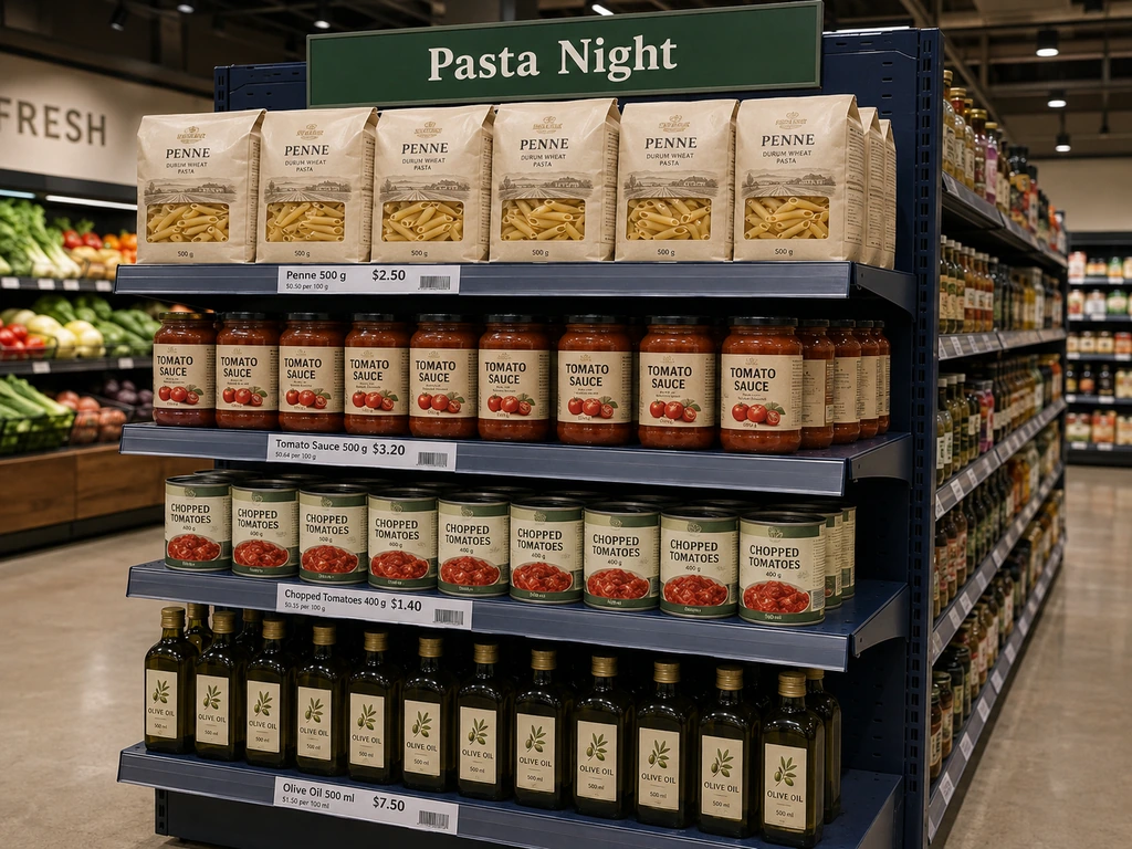
Start with a practical meal combination: pasta, sauce, and canned tomatoes on one end cap, with a clear sign explaining the occasion or offer. A breakfast feature could pair cereal, shelf-stable milk, and coffee. Show individual prices and any promotion conditions, keep products that require refrigeration in suitable fixtures, and assign a replenishment check so the display remains complete. This approach gives an ordinary store a manageable starting point before considering a custom-built installation.
Then there’s the Jordans cereal bowl — the display that launched a thousand case-study slides. The Valley Group built a giant cereal bowl from bent card over lightweight honeycomb board, placed it in Waitrose, and tracked a 4,711% sales uplift during the activation, with a sustained +511% halo effect afterward. The display captured 80,000 shopper interactions.
The lesson isn’t “build a giant cereal bowl.” It’s that a single high-effort focal point — one end cap, one stackout, one entrance feature — can generate returns that justify the entire creative investment for the quarter. Most retailers spread their display budget evenly across the store and get even, unmemorable results. Concentrate the budget on one showstopper, keep everything else clean and functional, and the contrast itself becomes the display strategy.
Sales uplift from a single creative display.
The Valley Group built a giant cereal bowl from bent card over honeycomb board for Jordans in Waitrose. The activation captured 80,000 shopper interactions and sustained a +511% halo effect after the campaign ended — proof that one high-effort focal point can return more than an entire quarter’s display budget spread thin.
From Inspiration to Execution — Making Creative Displays Work at Scale
By now you’ve collected more ideas than you can implement. That’s the easy part. The hard part is doing any of this consistently — across multiple locations, with limited staff, without the whole system falling apart the moment you stop paying attention to it.
Maintaining Consistency Across Multiple Store Locations
The multi-location problem is well-known: headquarters designs a beautiful planogram, sends a PDF to every store manager, and two weeks later every store has interpreted it differently — if they’ve implemented it at all.
Anthropologie solves this by hiring in-store artists and giving them creative autonomy within a brand framework. That model works brilliantly if you have Anthropologie’s margins and culture. For everyone else, consistency requires reducing the friction between “the plan” and “the execution.”
Practically, that means two things. First, a clear display playbook: specify the non-negotiables — focal-point placement, color palette, signage rules — and leave room for local teams to adapt product selection and prop sourcing to their store. Second, a tight verification loop: store teams photograph completed displays, headquarters confirms or corrects within 24 hours, and the feedback cycle gets shorter every round.
For chains investing in digital infrastructure, this equation changes entirely. When shelf-edge labels, promotional messaging, and even display color schemes can be updated remotely from a central dashboard, the “execution gap” between headquarters and stores shrinks to near-zero. The creative direction lives in software; the store team focuses on the physical elements — product arrangement, prop styling, lighting adjustments — that software can’t touch.
Rotating Displays Without Burning Out Your Team
Every retailer agrees that frequent display updates drive traffic. Almost none of them do it, because “update all the displays” ranks somewhere between “inventory count” and “root canal” on most store teams’ priority lists.
A sustainable rhythm looks like this: small adjustments every two to four weeks — swap the hero product, update one color accent, replace a single prop — and full thematic rotations quarterly. The small adjustments keep the store feeling alive; the quarterly rotations prevent the slow drift into staleness that happens when you only ever make small adjustments.
The bottleneck, in almost every case, is the shelf-edge work. Changing prices, swapping shelf talkers, updating promotional signage — this is the tedious, ladder-climbing, label-peeling labor that burns hours and enthusiasm. When retailers deploy digital shelf systems and electronic shelf labels, they consistently report that roughly 80% of the time previously spent on label management gets reallocated to higher-value work: visual merchandising, customer interaction, display creativity.
That’s the quiet promise of technology in retail display. It doesn’t replace creativity. It removes the friction that prevents creativity from happening at scale. When your team spends less time peeling labels, they spend more time making the store worth visiting — and worth coming back to.
Turn these creative retail display ideas into a repeatable plan: choose one concept, test it in a defined area, and use the results to guide your next refresh. Keep notes on the products, setup time, maintenance, and customer response so the next installation builds on what you learned.

 English
  Russian
  Spanish
  German
  Arabic
  French
  Bulgarian
  Polish
  Romanian
  Turkish
  Portuguese