


Types of Signage in Retail Store — A Complete Guide to Every Sign That Drives Sales
Walk into any store, and before you consciously register a single product, your brain has already processed dozens of signs. The storefront fascia told you whose space you’re entering. The aisle marker guided your first turn. The shelf tag answered the question you hadn’t yet asked: “How much?” None of this happened by accident. It happened because someone — a store owner, an operations manager, a visual merchandiser — made deliberate choices about what signage goes where, and why. This guide maps the major types of signage in retail store environments, from the curb to the checkout counter, so you can make those choices with clarity instead of guesswork.
What Is Retail Signage and Why It Matters
Retail signage is not just “signs.” It’s the systematic visual communication layer that sits between your store’s physical space and your customer’s decision-making brain. The distinction matters: a single poster is a sign; a coordinated set of fascia boards, wayfinding markers, shelf-level labels, and promotional displays that work together is a signage system. One is decoration. The other is infrastructure.
That infrastructure carries measurable weight. Signage influences an estimated 63% of in-store purchase decisions when shoppers compare similar products. Roughly 76% of consumers have walked into a store they had never visited before, purely because its signage caught their attention. And on the flip side, nearly 60% of shoppers have avoided entering a store entirely because they couldn’t tell from the outside what was inside, or once inside, couldn’t find what they needed. Signage isn’t ambiance — it’s your store’s silent sales floor, working every hour the lights are on.
At its core, retail signage serves four functions: attract (pull people in from outside), navigate (help them find their way once inside), inform (give them the details they need to decide), and convert (nudge them toward the purchase at the moment of maximum receptivity). Every sign in your store serves at least one of these masters. The best ones serve two.

Exterior Signage — Drawing Customers Through the Door
Everything the public sees from outside is exterior signage, and it carries a disproportionate burden: you have roughly three seconds of a passerby’s attention to communicate who you are, what you sell, and why they should walk through the door instead of past it. The retail signage examples below cover the main exterior formats. Choosing which exterior signage types to invest in comes down to three variables: viewing distance (are people seeing you from a car, across the street, or from the sidewalk?), budget structure (one-time capital spend versus frequent refreshes), and illumination need (are you open at night?).
Fascia and Building-Mounted Signs
The fascia sign is your storefront’s anchor — the primary brand-identity element mounted on the building face above the entrance. It’s the one sign every retail store needs before anything else. The three mainstream formats are dimensional lettering (individual raised letters mounted directly to the façade, clean and architectural), illuminated lightboxes (a backlit panel with your branding printed on a translucent face, highly visible at night), and flex-face systems (a tensioned vinyl skin stretched over an aluminum frame with internal lighting, the dominant choice for larger-format retail because it handles wind loads better and costs less to maintain than rigid lightboxes). If your store occupies a unit in a larger shopping center, the landlord likely has rules about fascia dimensions, illumination color temperature, and whether projecting signs are permitted — check before you order.
Projecting and Blade Signs
A fascia sign faces the street head-on, which means it’s invisible to anyone walking along the sidewalk parallel to your storefront. A projecting blade sign solves this by extending perpendicular to the building, catching pedestrians who are approaching from either direction along the street. This is the sign type most likely to be regulated by municipal code — many historic districts and main street programs have specific rules about projection distance, clearance height above the sidewalk, and whether internal illumination is allowed. Factor permitting into your timeline.
Window Graphics and Decals
Window graphics are the most malleable layer of exterior signage — relatively inexpensive, easy to swap seasonally, and positioned at the exact boundary between “outside attention” and “inside experience.” Full-coverage vinyl wraps create immersive brand moments but block natural light and sightlines into the store. Partial decals — a logo, a tagline, a curated product shot — strike a balance between visibility and transparency. One practical note: window graphics on west-facing glass in the afternoon can become nearly invisible due to glare if you choose dark colors against bright sun. Test a sample at the actual time of day your customers pass by.

A-Boards and Pavement Signs
If the fascia sign is the long-range lure, the A-board is the close-range closer — placed on the sidewalk within the last two meters before your door, where it catches the attention of someone who is already walking past but hasn’t yet committed to entering. The information window is brutally short: about 1.5 seconds of a pedestrian’s glance. That means one message, one hook. “Today’s Special,” a single striking number, a question that creates a knowledge gap. Anything more is invisible. Choose a weather-resistant model with enough weight to stay upright in wind; laminated print inserts give you the flexibility to change the message daily without replacing the hardware.

Monument and Pylon Signs
These are the large-scale, freestanding exterior signs designed for visibility from a moving vehicle rather than a sidewalk. Monument signs sit low to the ground, often at the entrance to a retail park or plaza, built from brick or stone to match the property’s architecture. Pylon signs are the tall, multi-tenant structures you see along highways and arterial roads — they list every business in a shopping center on a single tower. The practical consideration here is a formula most sign companies won’t volunteer: at 50 km/h (roughly 30 mph), a driver needs letters at least 15 cm (6 inches) tall to read them with enough time to react. Every additional 10 km/h of road speed demands proportionally larger lettering. If your store sits on a road with a 70 km/h limit, that 15 cm minimum becomes closer to 21 cm.
Interior Wayfinding and Informational Signage
Once a customer is inside, signage shifts from attraction to guidance. The two sub-functions — wayfinding (helping people locate things) and informational (helping people understand things) — work in tandem: one reduces friction, the other builds confidence. Together they address the single biggest in-store conversion killer: cognitive overload. When shoppers can’t find a category, can’t decode a price, or can’t tell two similar products apart, they don’t ask for help — they leave.
Directional and Wayfinding Signs
Wayfinding signage is the skeleton of your store’s navigation system, and it operates on what retail environment researchers call the “3-meter rule”: customers should see the next directional cue roughly 3 meters before they reach a decision point (a junction, a department boundary, a fork in the main aisle). Not at the decision point — before it. This determines both mounting height and sign size. The four workhorse formats are overhead hanging aisle markers (essential for supermarkets and any store above roughly 200 square meters), wall-mounted department headers (the standard for fashion, electronics, and category-based retail), floor graphics and directional arrows (which double as promotional space), and freestanding store directories (worth the floor space in any retail environment above 500 square meters where the layout isn’t visible from a single vantage point).
Product Information and Educational Signs
If wayfinding answers “where,” informational signage answers “what, why, and how much.” These are the signs customers actively seek out — they walk up to a product display looking for details, which means their attention is already volunteered. The formats range from basic shelf tags and price strips to more elaborate product description panels that explain materials, origin, care requirements, or comparative advantages. For high-consideration categories like furniture, electronics, and specialty foods, a well-written product information sign can substitute for a staff member who isn’t available. The design constraint is what signage professionals call the “3-word rule”: within a split-second glance, three key terms must dominate the visual hierarchy — the product name, the price, and the single most compelling differentiator. Everything else is secondary and should be visually subordinated.

Branded Environmental Signage
Beyond function, there’s feeling. Branded environmental signage — lifestyle photography walls, mission-statement installations, material-swatch displays that invite touch, timeline graphics that tell your company’s origin story — doesn’t direct traffic or explain a product feature. It communicates identity. Its ROI is the hardest to quantify because it operates in the subconscious: the first three seconds after a customer steps inside, before they’ve looked at any product or read any shelf tag, they’ve already formed a gut judgment about whether this place “feels like quality.” Environmental signage and interior design are what shape that judgment. The benchmark to study isn’t a sign catalog — it’s the Apple Store, where almost no traditional signage exists, yet every surface, material, and spatial decision communicates brand values with total consistency.
Promotional and Point-of-Sale Signage
Promotional signage is the only category in the store whose sole purpose is immediate conversion. Unlike exterior signs (which attract) or wayfinding signs (which guide), a promotional sign exists to trigger a purchasing decision right now, at this display, for this product. The format range across these retail signage displays is wide, and the key to using it effectively is matching the format to the placement, the product, and the promotional window.

| Signage Type | Best Placement | Best For | Typical Lifespan | Key Consideration |
|---|---|---|---|---|
| Shelf Talkers | Shelf edge, at product | Price drops, new arrivals, “staff pick” | 2–4 weeks | Tiny real estate but zero distance from the buying decision |
| End-Cap Displays | Aisle end-faces | Seasonal heroes, clearance, high-margin push items | 2–8 weeks | The single highest-ROI display position in any store layout |
| Ceiling Danglers | Aisle center, above sightline | Category navigation, sale atmosphere | 4–8 weeks | Requires minimum 2.7m ceiling height; lower ceilings create clutter |
| Floor Graphics | Aisle floors, queue zones | Directional + promotional dual use | 1–3 months | Must use slip-rated material; test adhesion on your specific floor surface |
| Countertop Displays | Checkout, service desks | Impulse add-ons, loyalty program enrollment | Ongoing / seasonal refresh | Captive attention window — the only moment a customer has nowhere else to look |
| Roller Banners | Entrance, event zones | Flash sales, new collection launches, pop-up events | 1–6 months | Portable and standardized; ideal for multi-store chains running the same promotion |
| Window Posters | Storefront glass | Seasonal campaigns, grand opening, clearance | 2–6 weeks | Layered on top of permanent window graphics for promotional bursts |
A common mistake is treating promotional signage as an “always on” layer — more signs, more volume, permanently. The stores that do it best use a pulse strategy: promotional density peaks around payday weekends, seasonal transitions, and the two weeks before major holidays, then dials back to baseline. Signage clutter trains customers to ignore all of it.
Retail Digital Signage and Electronic Shelf Labels — The Smart Layer
Most guides to retail signage stop at the categories above. From a planning perspective, in store signage operates at three distinct “information speeds.” Static signage changes quarterly — your fascia, your wayfinding headers, your branded walls. Dynamic displays change daily or weekly — promotional screens, menu boards, video walls. And real-time data changes by the minute — prices, inventory status, time-sensitive offers. These aren’t competing technologies. They’re three tiers of the same system, each handling the information that updates at its natural frequency.
In-Store Digital Screens and Video Walls
Digital screens solve the economic problem of frequent content changes. Every time you reprint a static promotional poster, you pay for printing, shipping, and in-store labor to swap it. A digital screen at the same location updates instantly across one store or a thousand, at zero marginal cost per change. The format has matured rapidly: a landmark 2025 study published in the Journal of Marketing, analyzing 237 advertising campaigns across 30 million shopper visits, found that shoppers exposed to in-store digital displays were 8.1% more likely to purchase the advertised product — an effect 50% greater than traditional brand advertising averages. Other industry data points converge on the same conclusion: digital signage captures roughly 400% more views than static signs in equivalent positions, and retailers that adopt it report repeat-customer increases of up to 33%.
For deployment, three scenarios dominate: window-facing screens (which require a minimum brightness of 2,500 nits to be readable in direct sunlight — standard indoor panels at 350–500 nits will look like a black mirror), in-aisle wall-mounted displays positioned at decision points, and video walls for flagship locations where immersive brand storytelling justifies the investment. The content rule that makes or breaks effectiveness: keep each screen’s message to five to seven words and rotate frames every three to five seconds. Longer dwell times trigger visual habituation — the brain stops registering a screen that doesn’t change.
Behind every one of these deployments is the display panel itself. In retail, the workhorse is commercial-grade LCD — purpose-built for 24/7 operation with rated lifespans of 50,000 hours or more, unlike a consumer TV pressed into store duty. Panel sourcing is the spec that separates reliable installations from constant maintenance: displays built on BOE, LG, or Samsung OEM panels deliver the brightness consistency and color accuracy that retail environments demand, particularly for window-facing and high-ambient-light positions. When you’re evaluating digital screen hardware, look past the enclosure to the panel inside. It determines whether the screen is still readable three years in, running 12 hours a day under store lighting — or whether it’s already dimmed to the point of invisibility.
Interactive Kiosks and Smart Mirrors
When digital signage shifts from broadcast to dialogue, you get interactive kiosks — touchscreen stations where customers browse the full catalog, check inventory availability across locations, or place orders for out-of-stock items. Their core economic logic is expanding “discoverable SKUs” without expanding physical shelf space. A store that can only display 2,000 products on its floor can make 20,000 browsable through a single kiosk. The interaction-design constraint that matters more than screen resolution or processor speed: if a customer cannot reach their target product in three taps or fewer, the abandonment rate passes 60%. Design the navigation tree accordingly.
Electronic Shelf Labels (ESL) — The Missing Piece
Electronic Shelf Labels represent the third tier of the smart signage stack, and they are the category most conspicuously absent from traditional retail signage guides. An ESL is a small e-paper display — the same bistable screen technology found in e-readers — that replaces a paper price tag on a shelf edge. Unlike an LCD screen, e-paper consumes power only when the displayed content changes, which is how ESLs achieve a five-to-ten-year battery life from a single coin cell. A wireless base station communicates with every label in the store simultaneously, pushing price updates, promotional flags, QR codes, or inventory-status indicators across tens of thousands of SKUs in seconds.
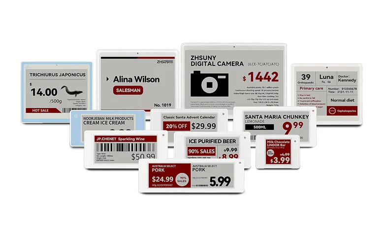
The operational math is straightforward: a mid-size supermarket carries roughly 15,000 SKUs and runs 50 to 200 price-change cycles per year. Each cycle requires three to five staff members spending four to six hours manually swapping paper tags — an annual cost measured in thousands of labor hours. ESL collapses that process to a single system command, and the freed labor shifts to higher-value tasks like customer service and merchandising. The global ESL market, estimated at approximately $2.1 to $2.7 billion in 2025, is projected to grow at 12% to 17% annually through the early 2030s, driven by retail automation, dynamic pricing adoption, and the broader IoT integration of physical stores.
When evaluating ESL systems, a few specifications separate mature solutions from early-stage products. First, communication-protocol openness: MQTT-based platforms integrate more easily with existing ERP and POS infrastructure than proprietary protocols. Second, display-color capability: four-color e-paper, commercialized in 2024, enables promotional highlighting that monochrome ESLs cannot replicate. Third, quality consistency at scale: leading manufacturers now achieve defect rates as low as 0.0018% across deployments of tens of thousands of units — and this number directly determines whether your in-store team spends time on merchandising or troubleshooting hardware. For operations teams exploring ESL for the first time, the practical starting point is a single-department pilot in produce or dairy, where price volatility is highest. Measure the labor savings and pricing accuracy gains before scaling to the full store.
Together, commercial-grade LCD screens and ESL systems form the two halves of a complete retail digital layer. LCD handles the big, dynamic storytelling surfaces — the window display that stops a passerby, the aisle screen that announces a promotion. ESL handles shelf-level precision — getting the right price on the right SKU at the right moment, across thousands of products, without anyone touching a paper tag. If you’re ready to explore how LCD and ESL fit into your retail signage stack, a detailed product overview is available on the ZhSunyco website.
Building Your Retail Signage Mix — A Practical Framework
Knowing all the types of retail signage is not the same as knowing which ones your store actually needs. The following framework distills the decision into three steps.
Step one: sequence your priorities by store stage. If you’re opening a new location, the procurement order should be: fascia and main storefront identity first (you can’t open without it), wayfinding infrastructure second (customers need to navigate from day one), shelf-level pricing and product identification third (the transactional baseline), promotional display hardware fourth (you need something to promote into), and digital or ESL layers last (these amplify an existing operation; they don’t create one from scratch). If you’re refreshing an existing store, reverse the logic — the fastest ROI usually comes from upgrading the layers closest to the purchase decision, which means shelf-level and promotional signage improvements pay back before a fascia redesign does.
Step two: budget by lifecycle, not by category. Instead of asking “how much should I spend on exterior signs versus interior signs,” split your signage budget into three buckets: permanent infrastructure (fascia, wayfinding structural elements, mounting hardware — one-time capital expenditure with multi-year depreciation), cyclical refresh (promotional displays, seasonal window graphics, shelf-talker print runs — operating expenditure that follows the retail calendar), and technology investment (digital screens, ESL systems, interactive kiosks — capital expenditure with ongoing software and content-management costs). A rough starting allocation for a mid-size store is 40% infrastructure, 30% cyclical, and 30% technology, adjusted by your category: a fashion retailer might tilt toward cyclical (more seasonal refreshes), while a grocery chain tilts toward technology (ESL pays back faster when SKU count and price-change frequency are high).
Step three: avoid the two most expensive mistakes. The first is assuming every store in a chain should have identical signage. Different locations face different pedestrian approach angles, different sun orientations, and different competitive adjacencies. The fascia that works on a north-facing storefront in a covered mall may be nearly invisible on a west-facing storefront with direct afternoon sun. The second mistake is over-signing. Research in environmental psychology has documented an attention-dilution threshold: when more than five distinct signage elements occupy the same visual field, recall of any single one drops sharply. High-end boutiques that use only two or three meticulously designed signs per zone outperform cluttered discounters on conversion rate per square foot — not despite having fewer signs, but partly because of it.
Design Principles That Make Signage Work
Choosing the right type of signage is half the equation. Executing it so people actually read it is the other half. Five principles, each grounded in how the human visual system processes information in a retail environment.
The five-second rule. If a customer walking past your sign at normal pace cannot grasp its core message in five seconds or less, the sign has functionally failed — not because the customer isn’t paying attention, but because the sign demanded more cognitive effort than a moving brain is willing to allocate. Test this yourself: print a draft at full size, mount it in the actual position, and walk past it at the speed your customers move. If you can’t recite the main message afterward, simplify.
Contrast beats color. In the lighting conditions of a real retail floor — mixed fluorescent and LED, variable brightness, shadows from shelving — dark text on a light background consistently outperforms any color-on-color combination for legibility. The eye doesn’t read color; it reads contrast. Design for contrast first, then layer in your brand palette.
Eye level is buy level. The optimal vertical mounting zone for signage in adult-height retail environments is 48 to 60 inches (approximately 120 to 150 cm) from the floor — the natural sightline range when standing. Signs mounted above head height or below knee level see attention drop by more than half. The exception is overhead hanging signage in wide-aisle environments like supermarkets, where the customer’s sightline naturally rises to scan the space ahead.
One sign, one message. The most common failure mode in retail signage is the sign that tries to say everything. It says “50% off” and “new collection” and “while stocks last” and “made in Italy” and “as seen in Vogue.” The customer reads nothing. If you have three messages to communicate, make three signs and place them at three different points along the customer journey.
Signs have a shelf life. A faded window decal, a curling shelf talker, a dusty lightbox — each one silently communicates that the store doesn’t care about details. Establish a monthly walk-through audit: check every sign for physical condition, current relevance, and alignment with the active promotional calendar. Replace, refresh, or remove. The absence of a sign is neutral. A damaged one is actively harmful.
The best signage system doesn’t shout louder than the store next door. It answers the customer’s unspoken questions at exactly the moment they arise. What is this place? Where do I find what I need? Is this worth the price? The stores that answer clearest, fastest, and most consistently are the ones people come back to.

 English
  Russian
  Spanish
  German
  Arabic
  French
  Bulgarian
  Polish
  Romanian
  Turkish
  Portuguese